I’m a Berlin-based graphic designer focused on brand identities and visual languages. I approach design as a way of researching context, defining meaning, and building visual systems where form and content reflect the project’s inner logic. My goal is to create design that feels relevant, intentional, and aligned with the project's cultural and emotional landscape.
Selected works
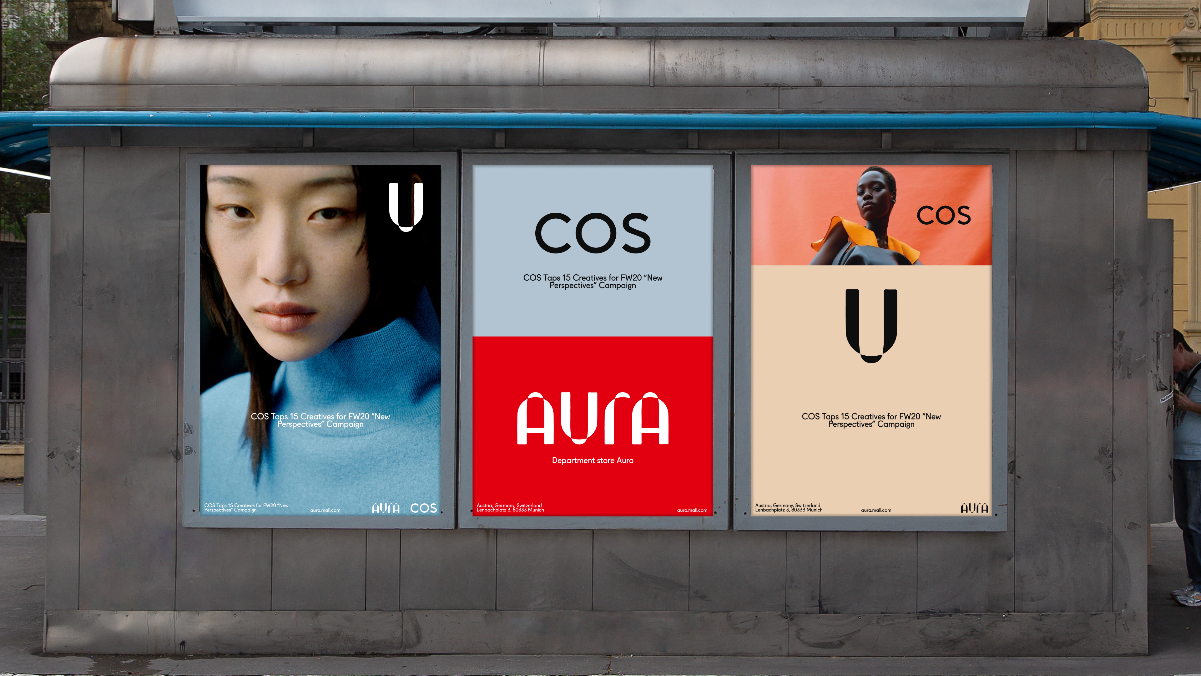
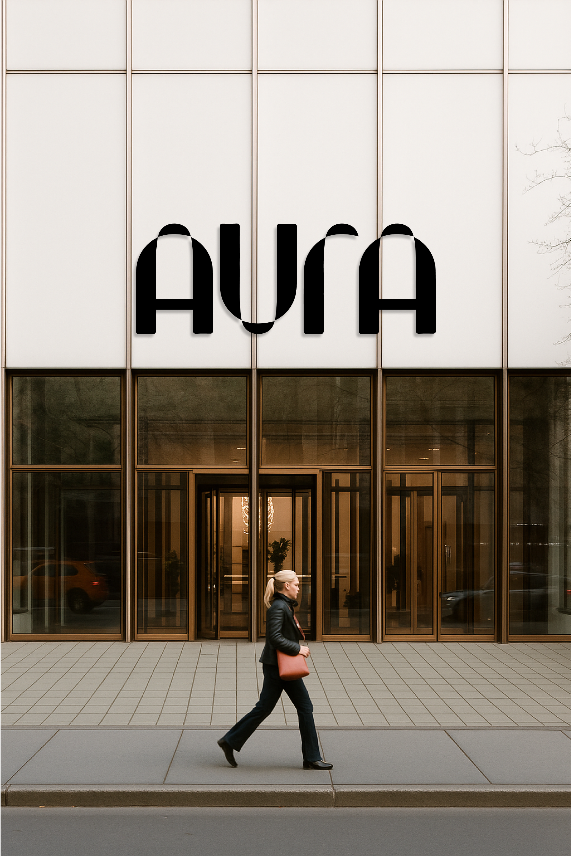
- AURA
BACKGROUND
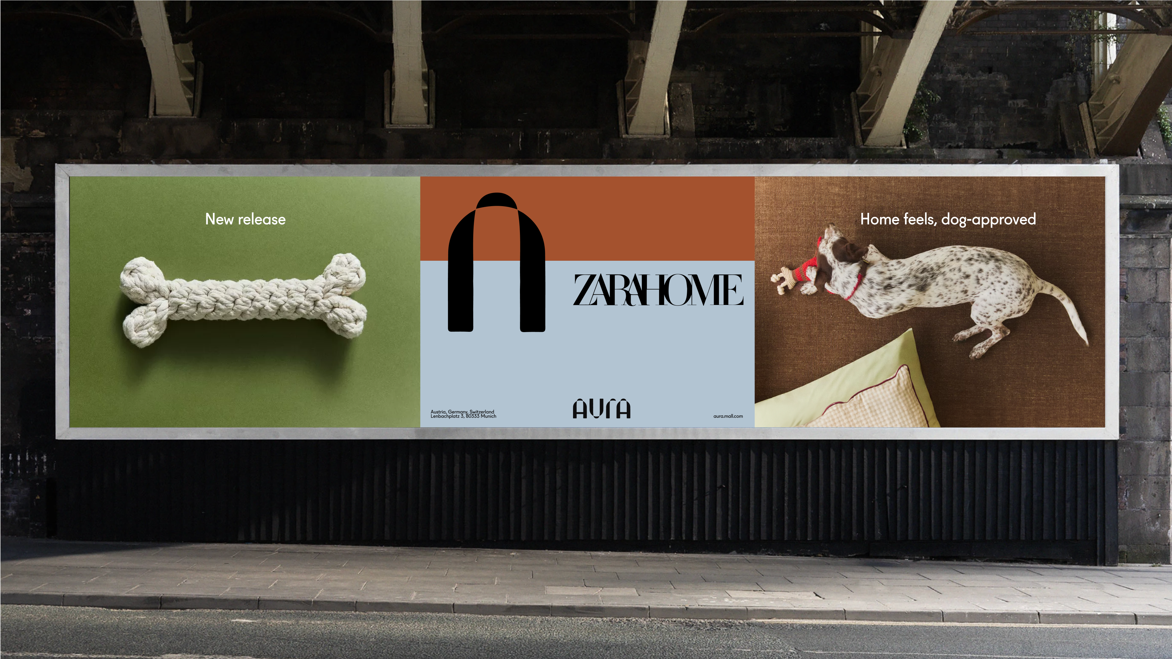
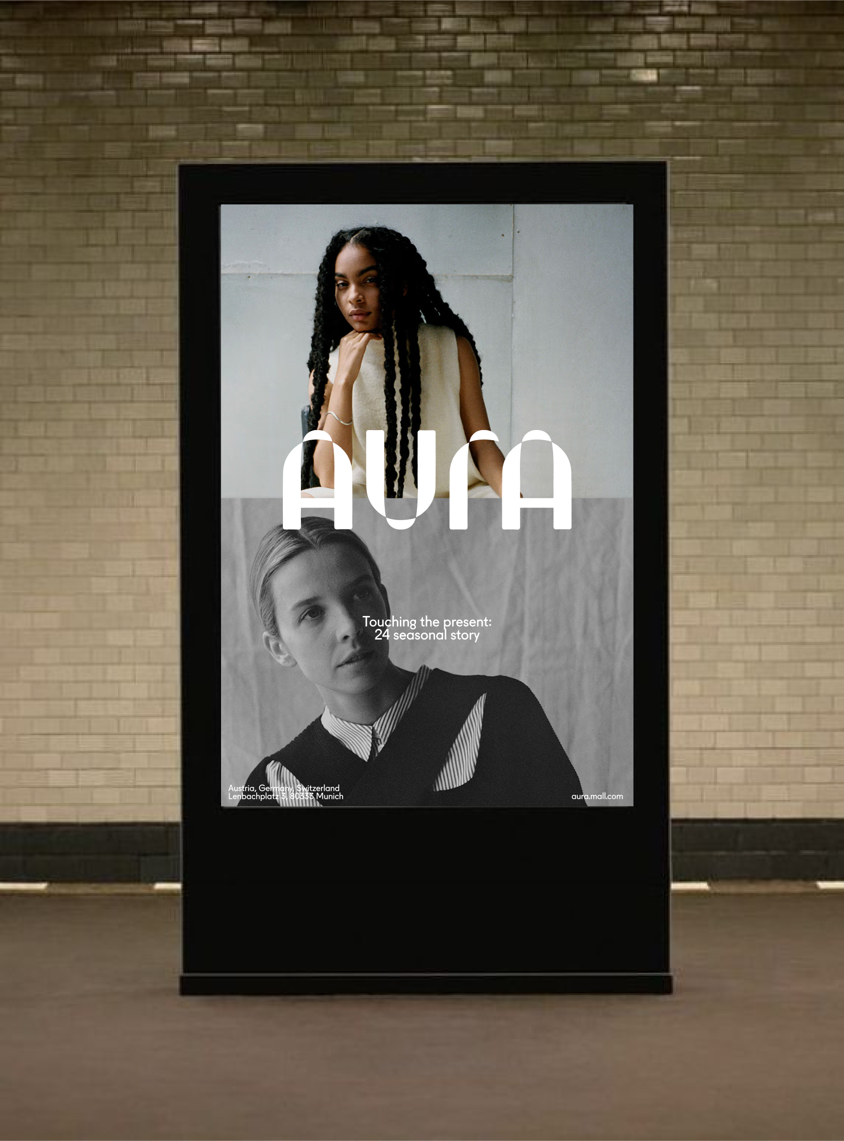
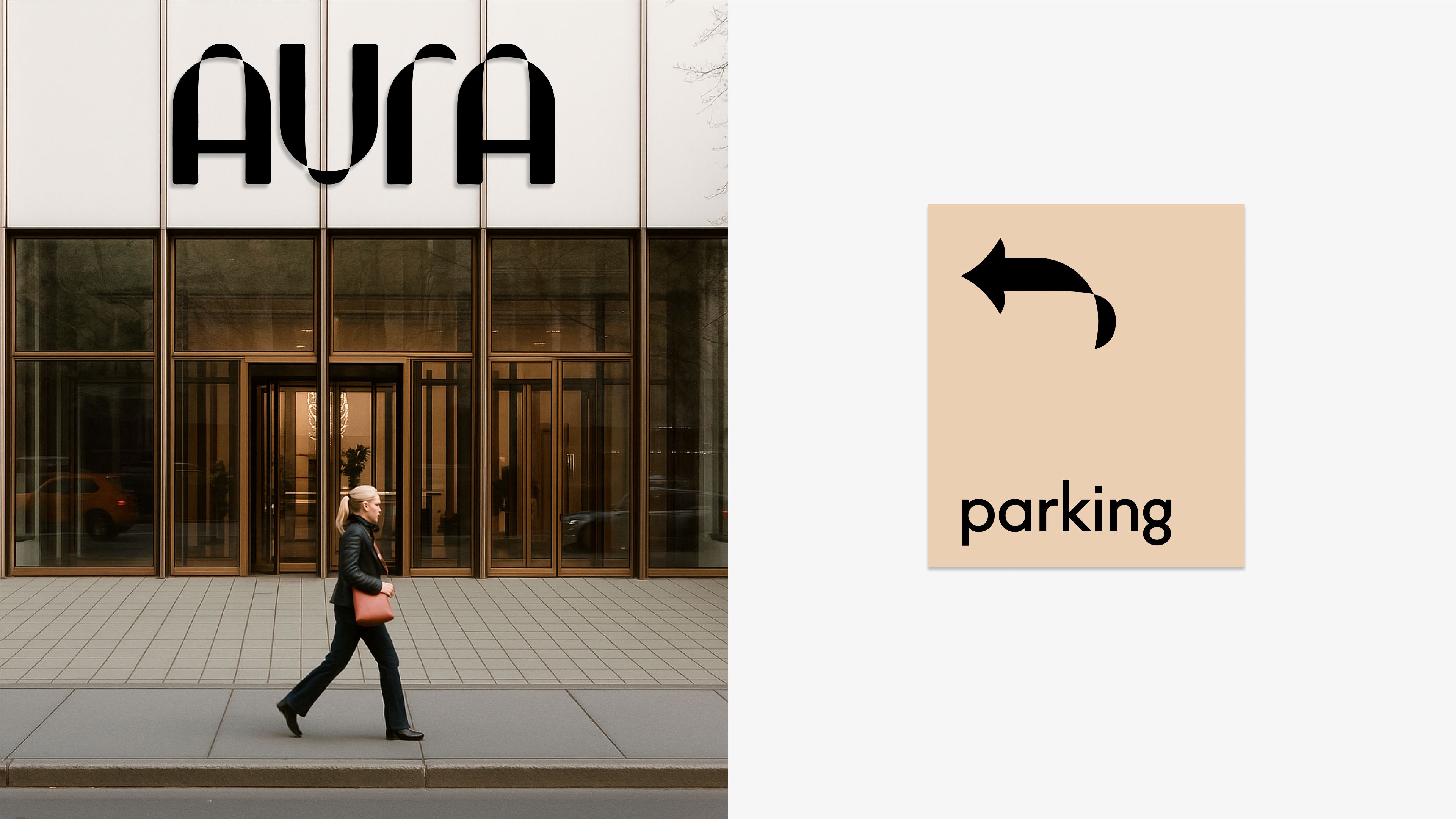
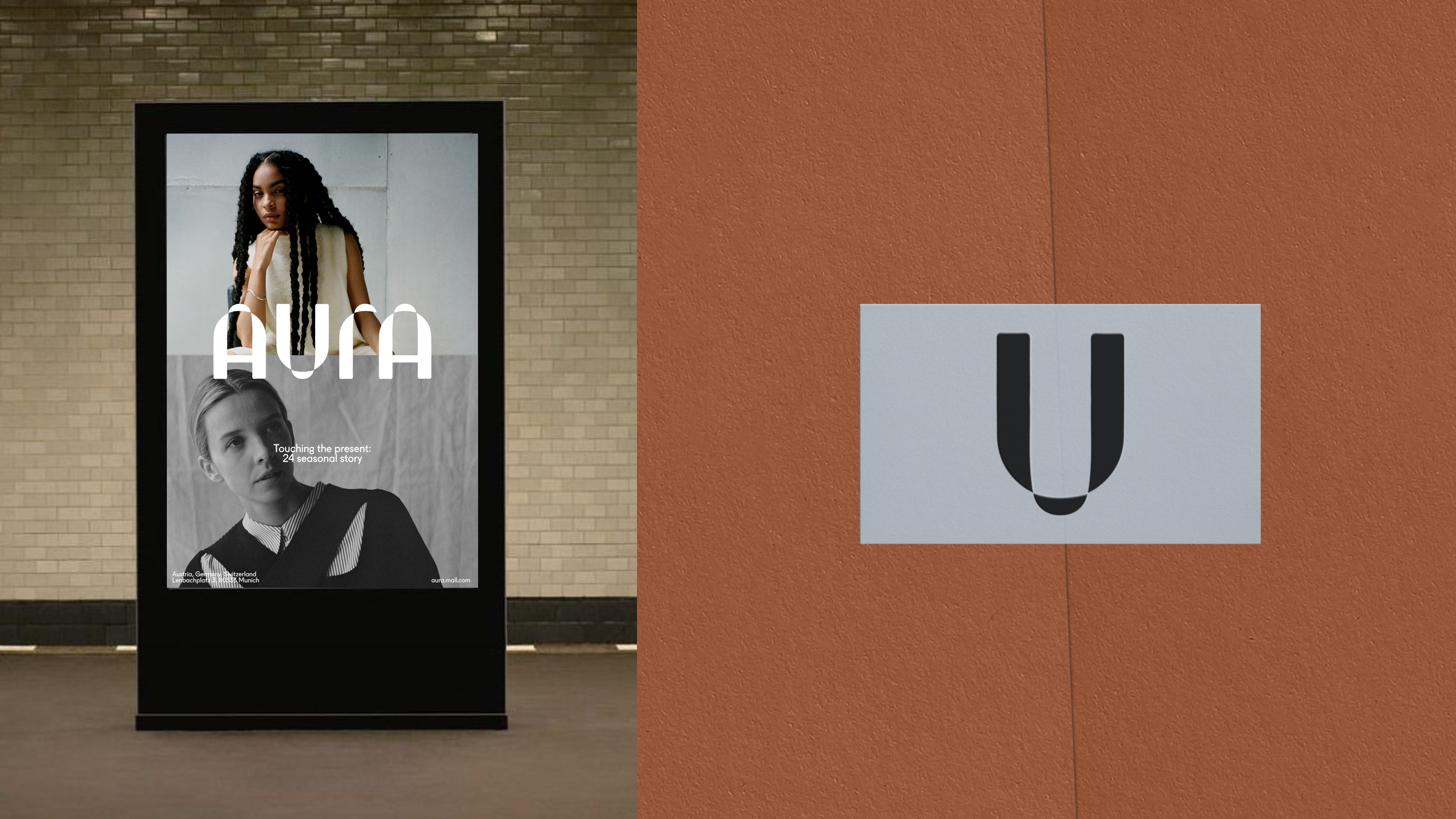
Aura is a concept identity for a shopping mall, developed as part of a client project at Tuman Studio. The work responds to the shifting role of offline retail: in a world where most shopping has moved online, physical spaces need to offer more than just goods — they need to create tangible, memorable experiences.
goal
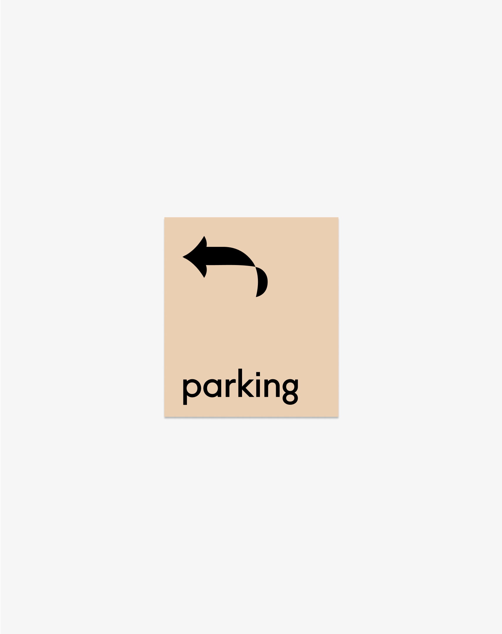
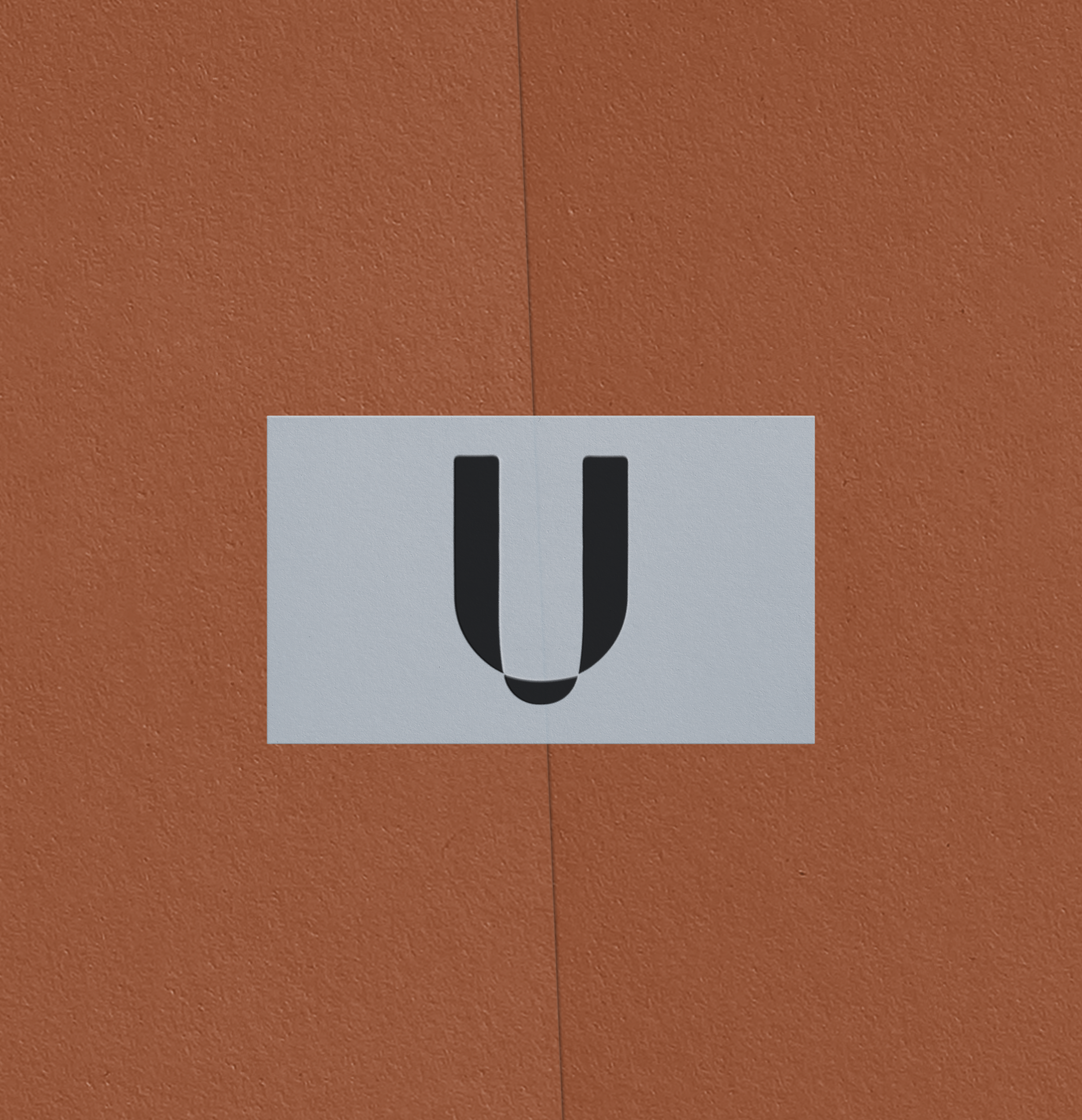
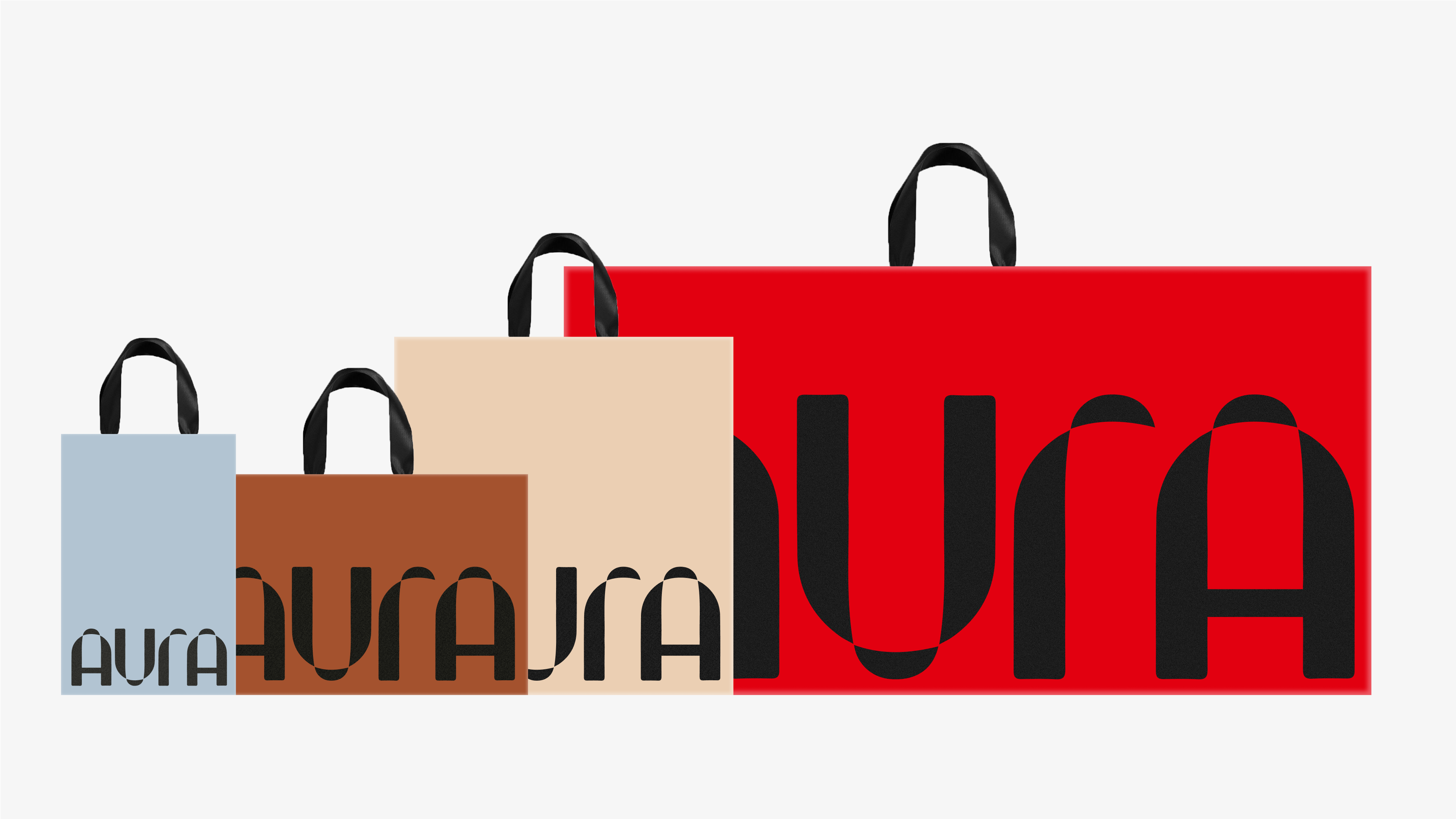
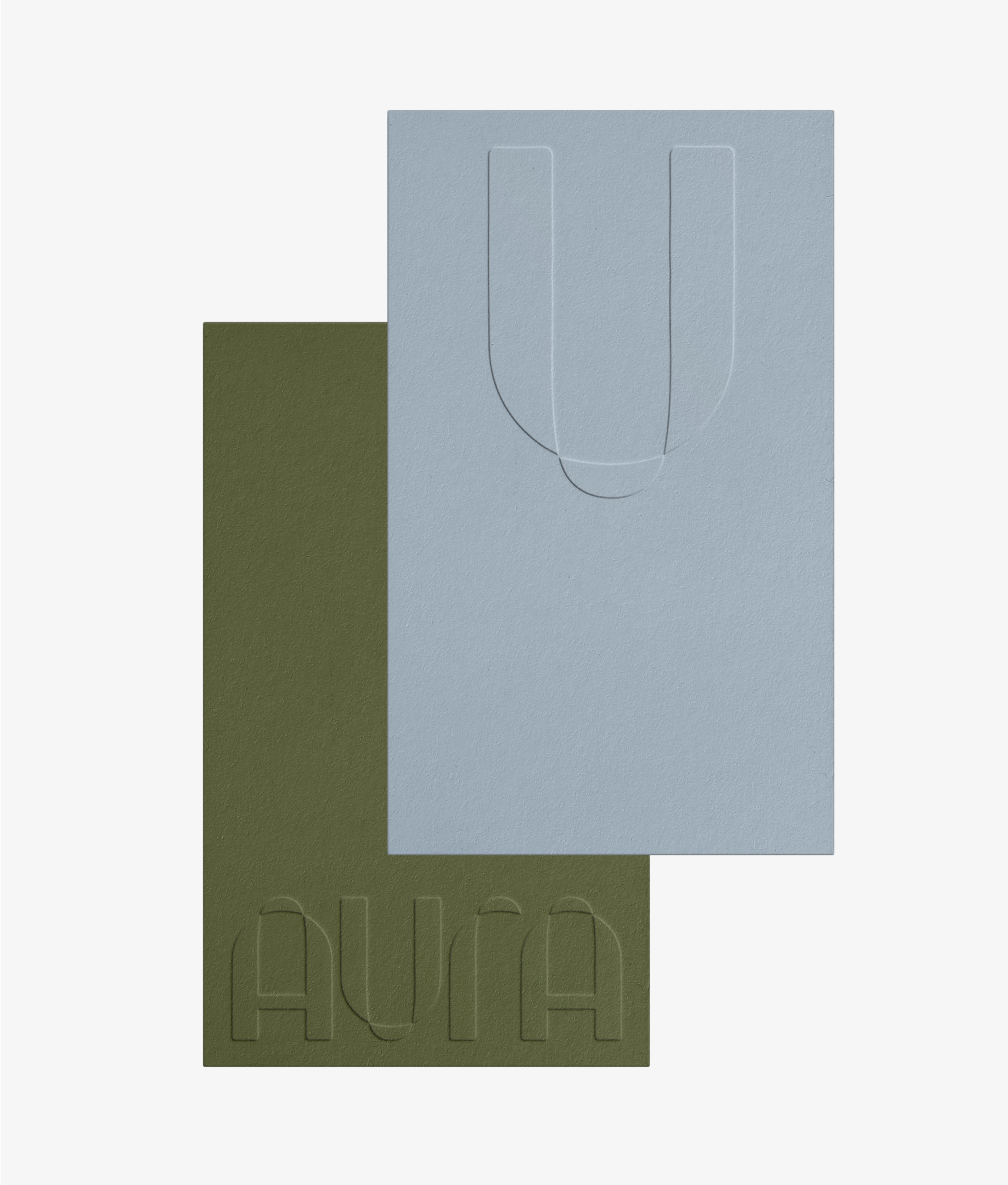
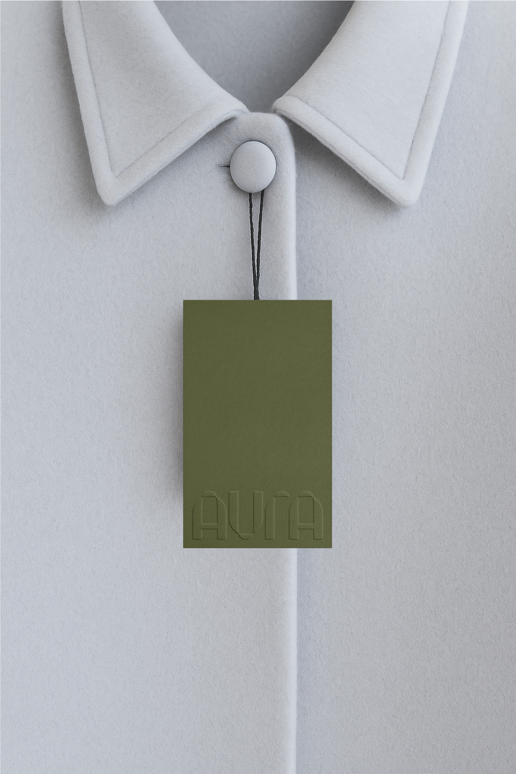
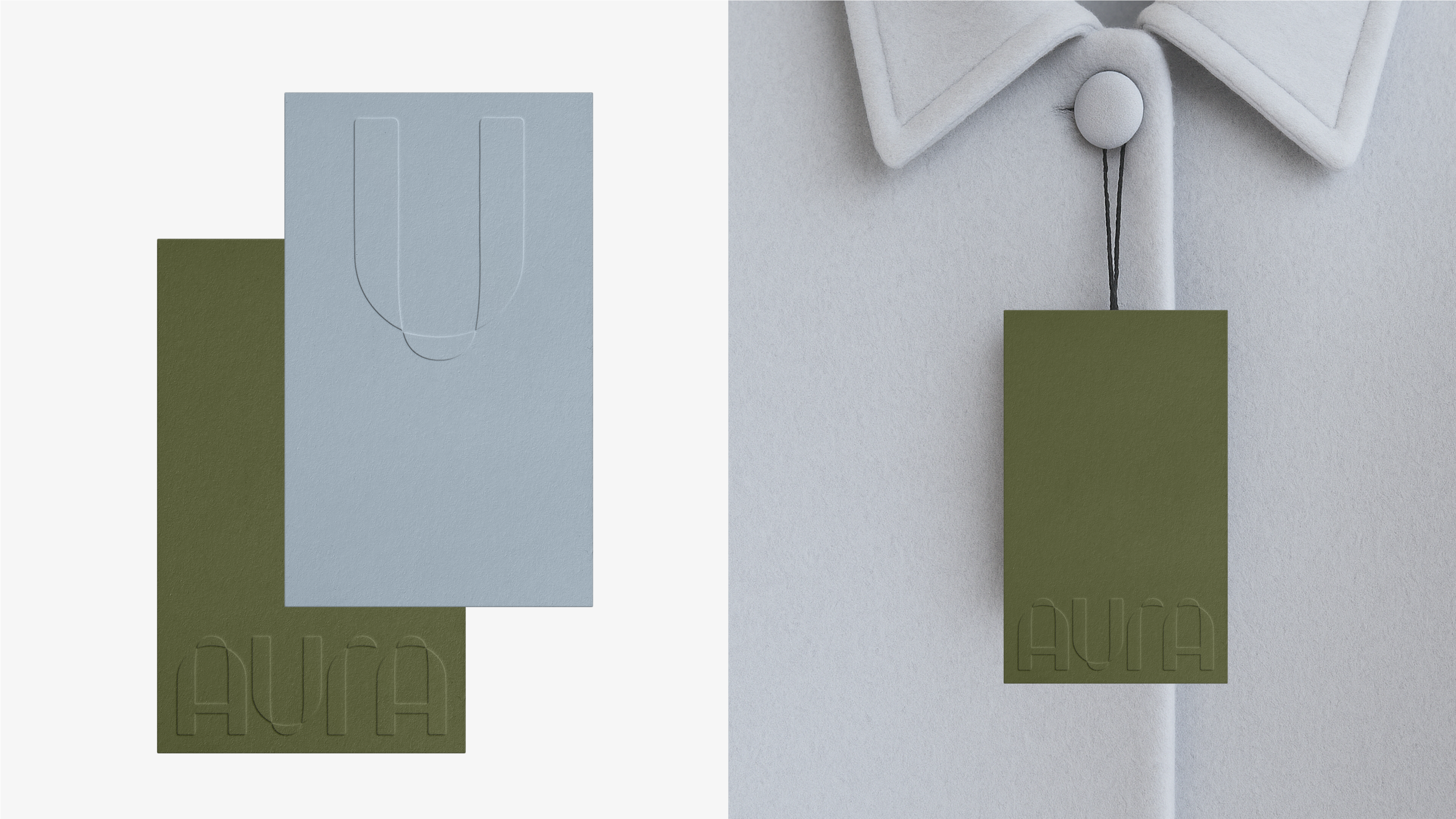
The metaphor is built around the shopping bag — a simple, universal symbol of offline retail. Its handle becomes the key visual element: applied across different brand creatives, it unifies the mall's diverse tenants and voices into one cohesive system. Each partner's content, once framed by the handle, turns into a shopping bag — something you take home.
IDEA
This approach also offers a playful and lightweight branding tool: by simply adding the handle to any visual, it instantly becomes part of Aura’s world. Whether it's a fashion shoot, a campaign image, or a product — the identity adapts without overcomplicating or overriding existing brand tones. The same shape forms the basis of the logo and graphic language, reflecting the tactile, carry-away nature of offline shopping in a flexible and minimal way.
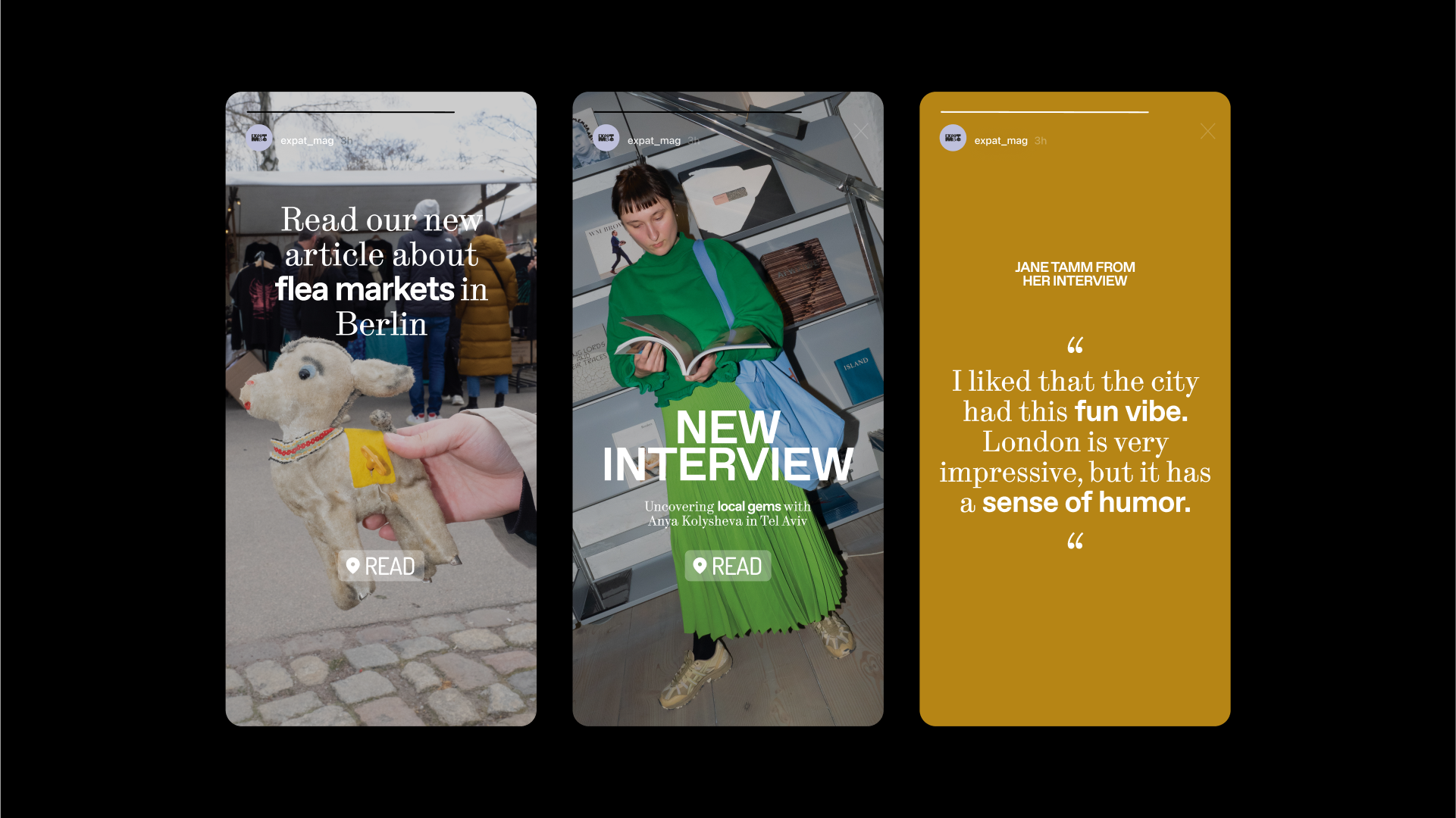
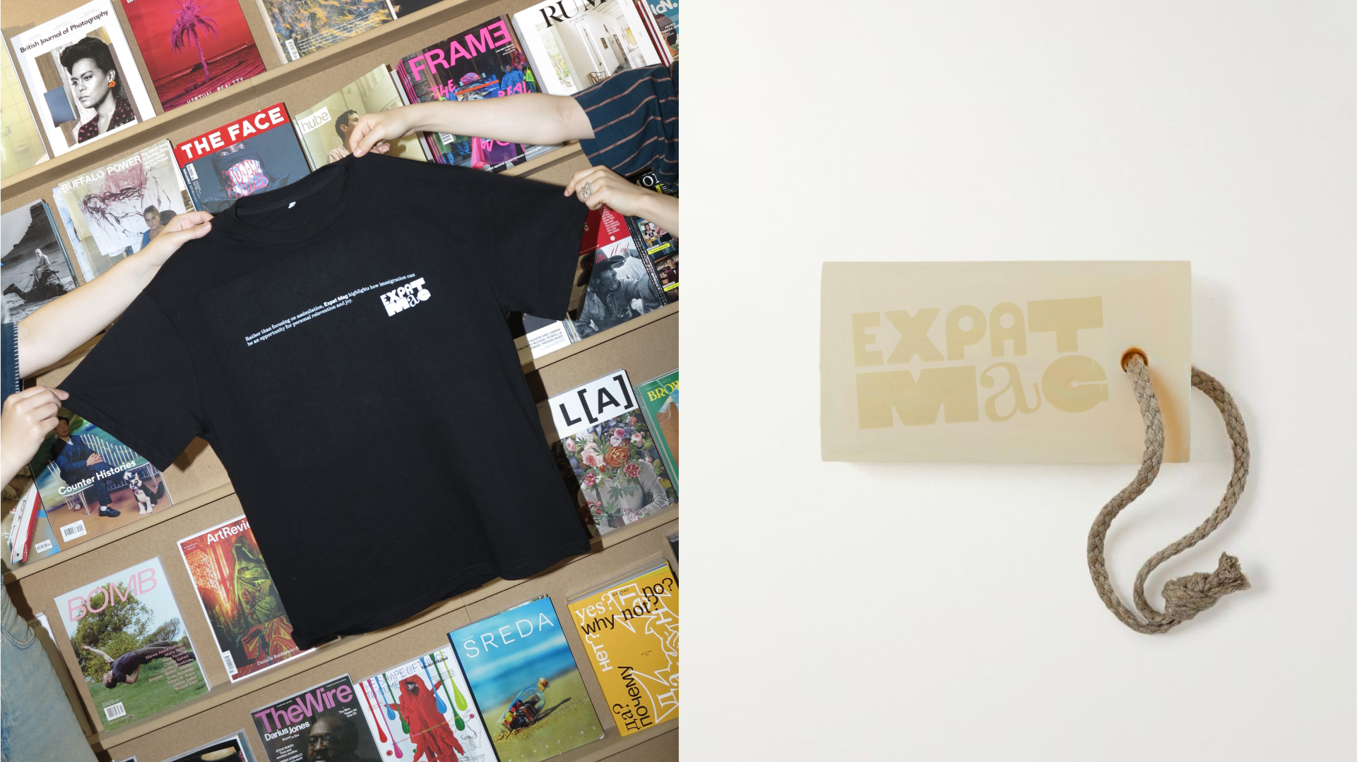
- expat mag
BACKGROUND
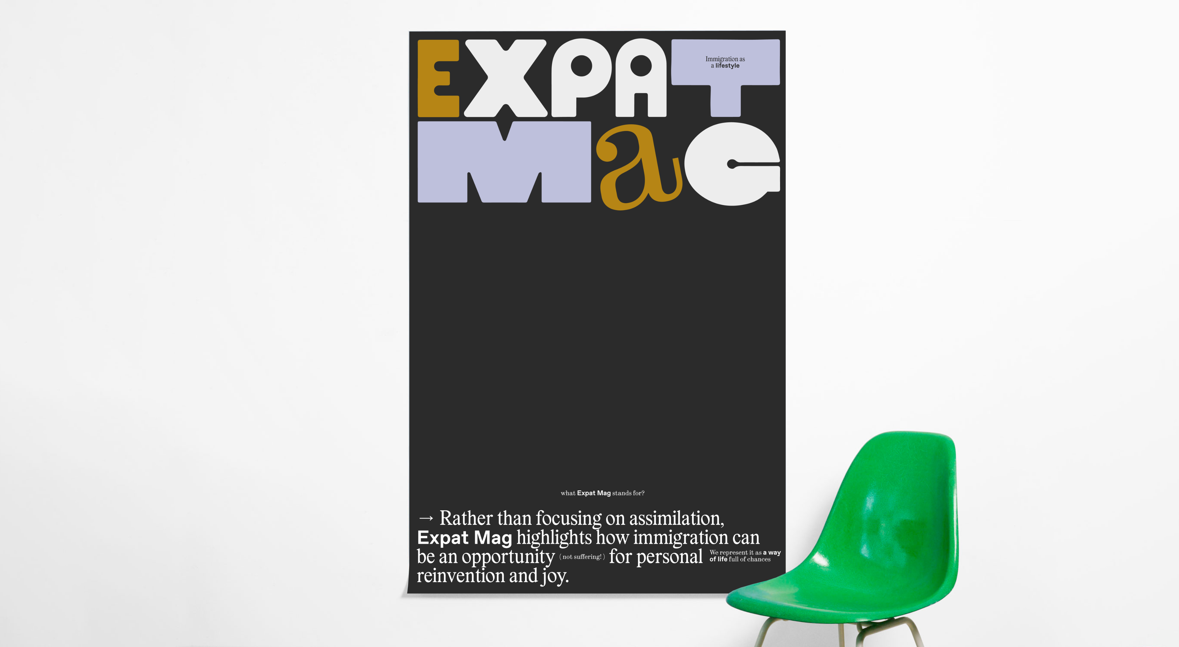
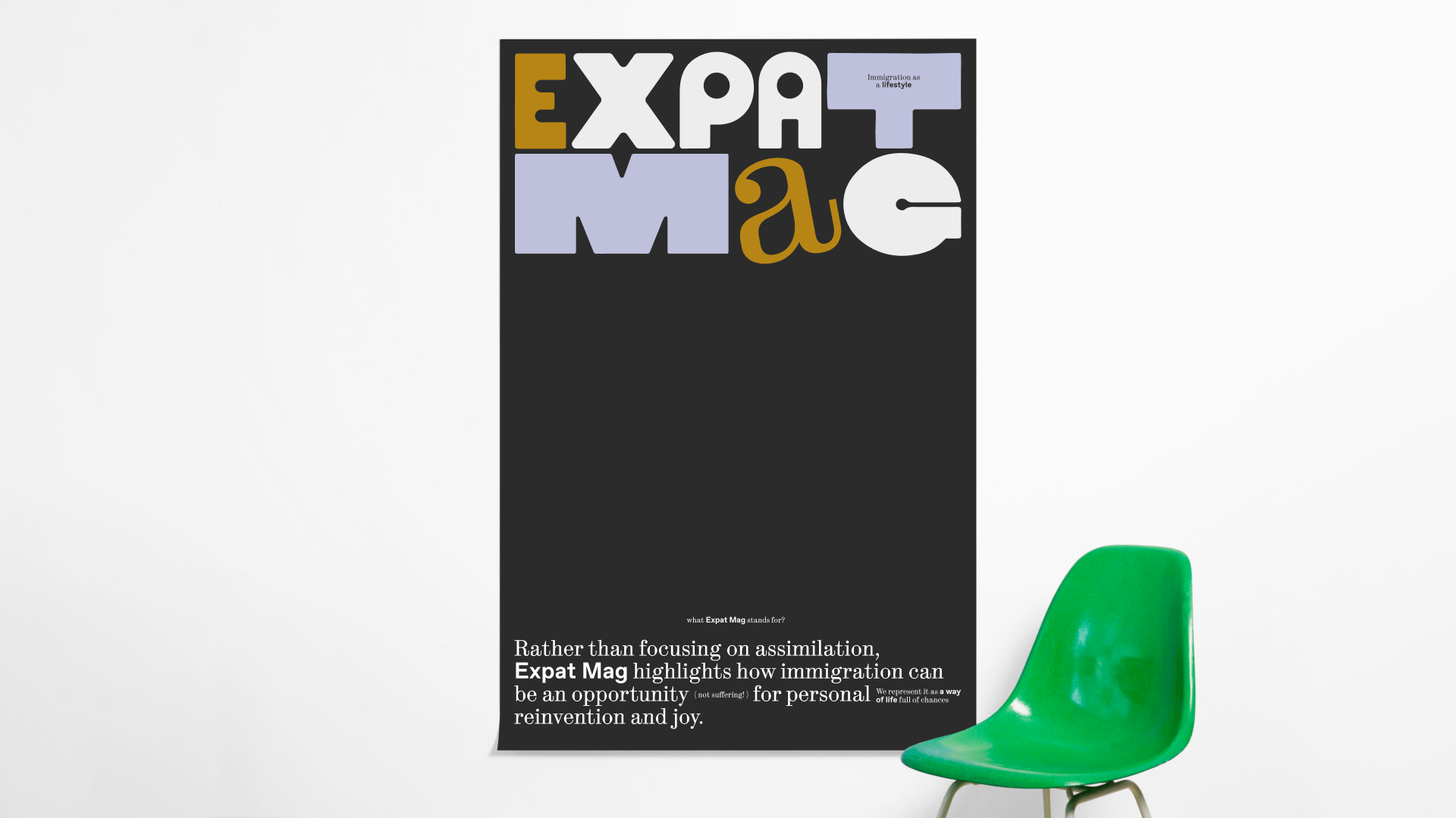
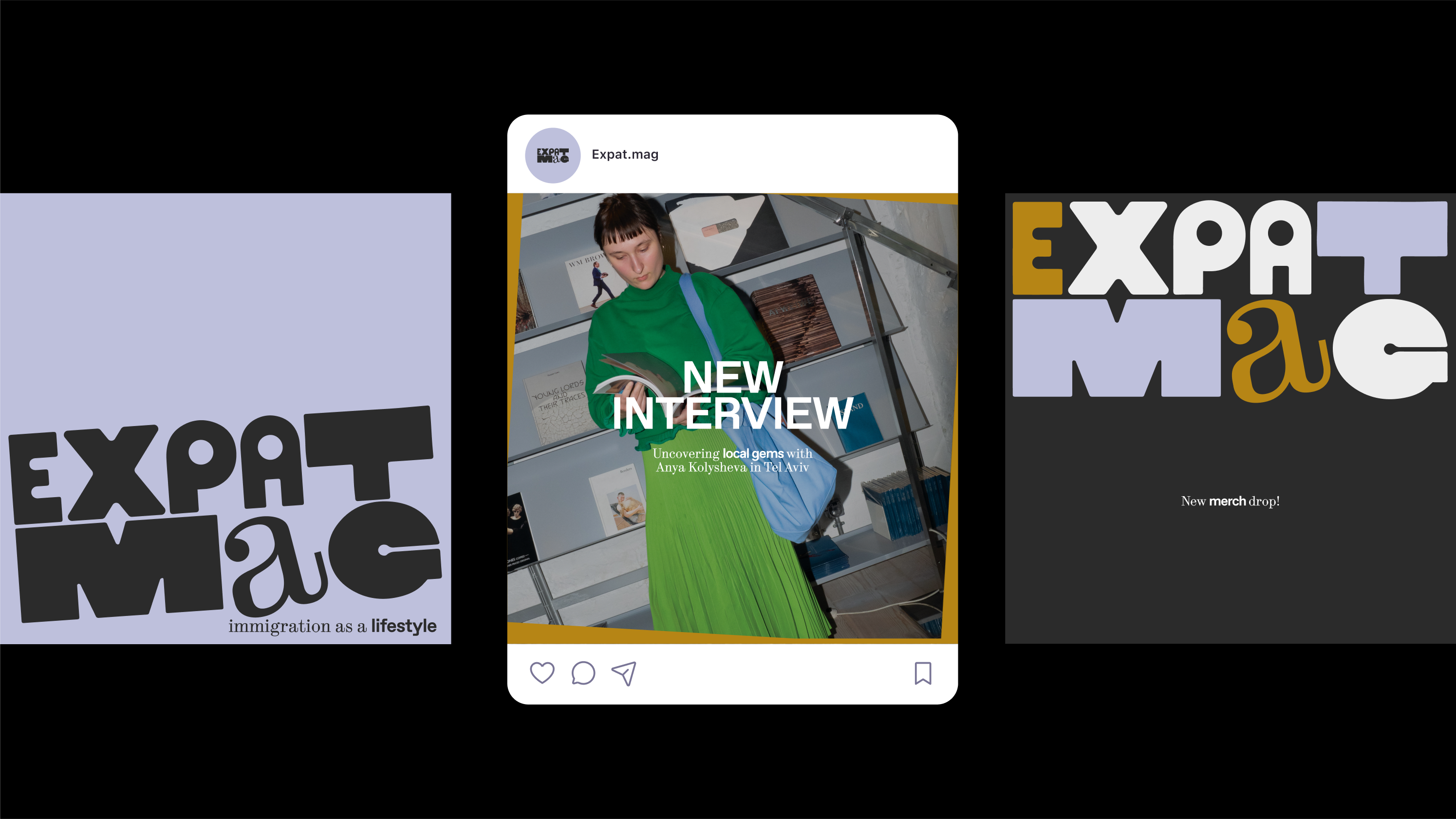
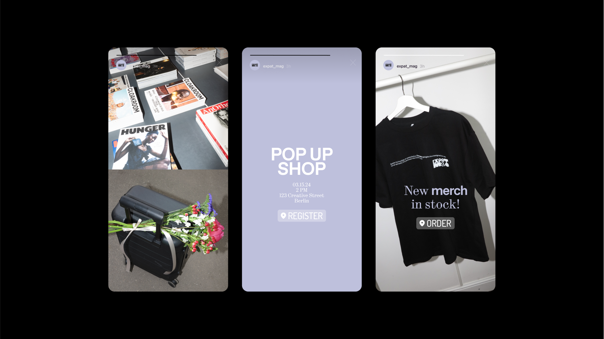
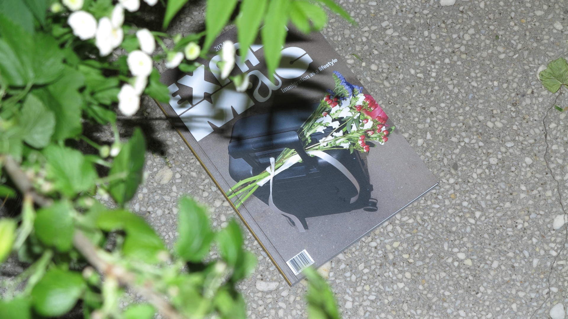
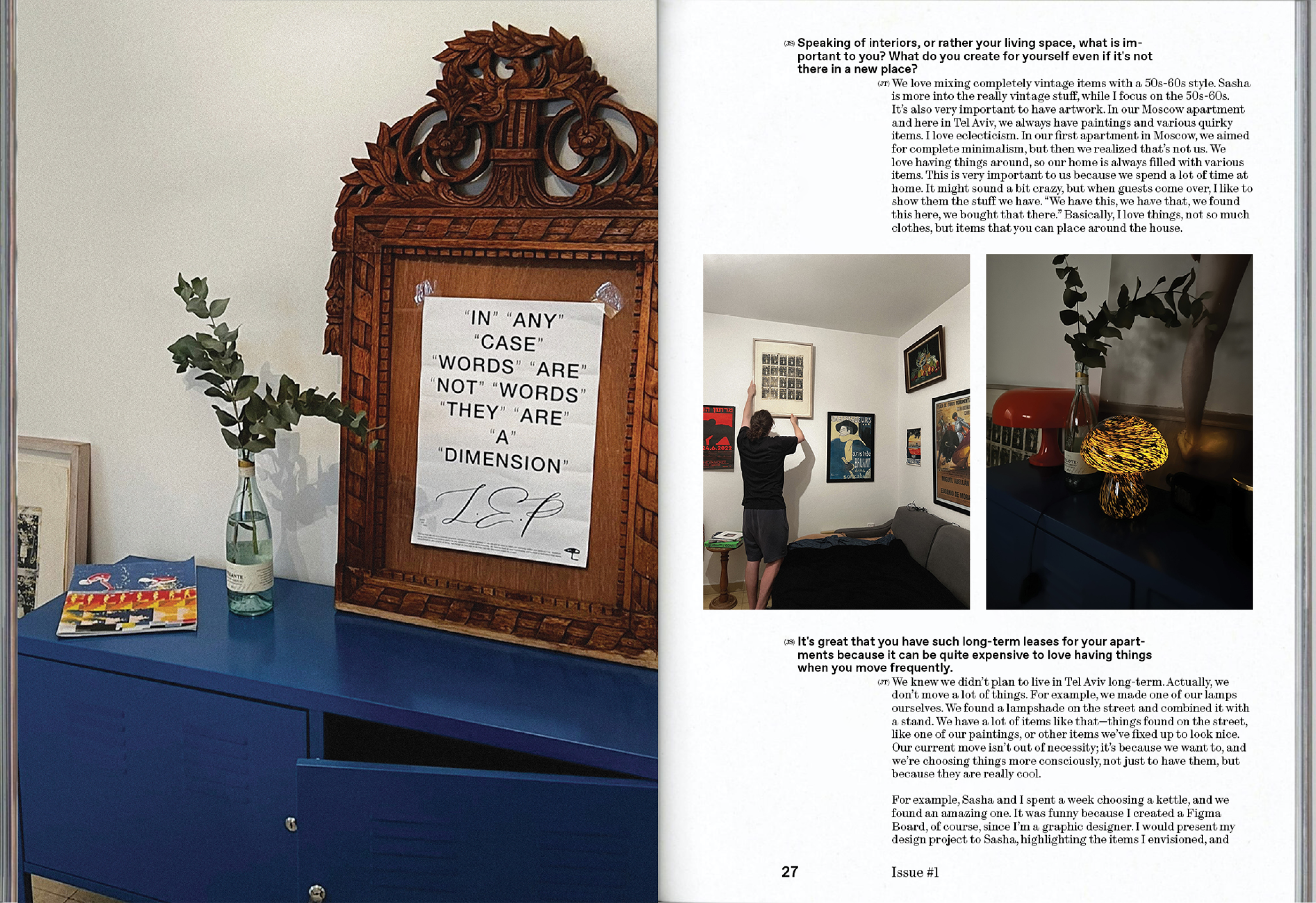
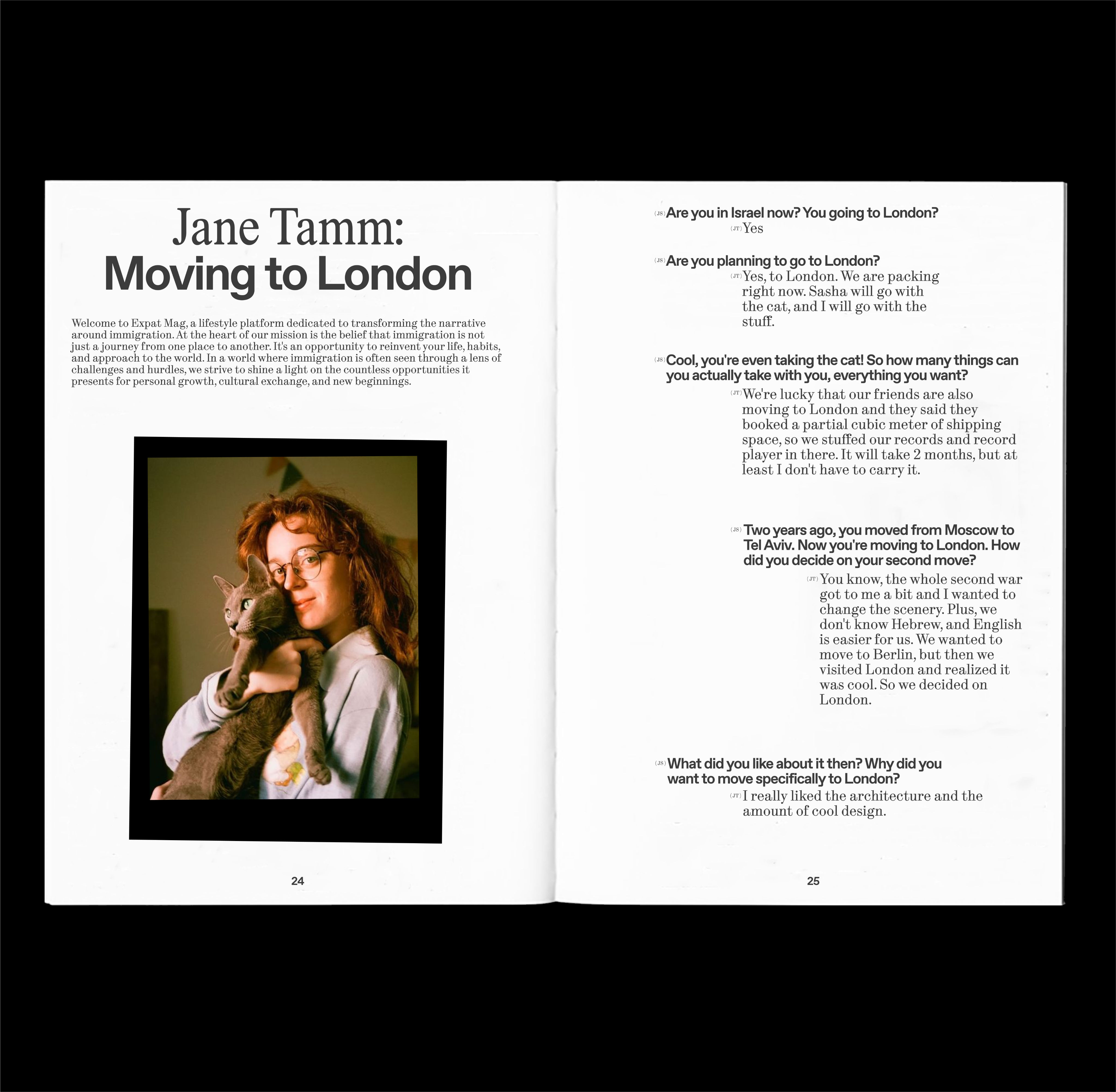
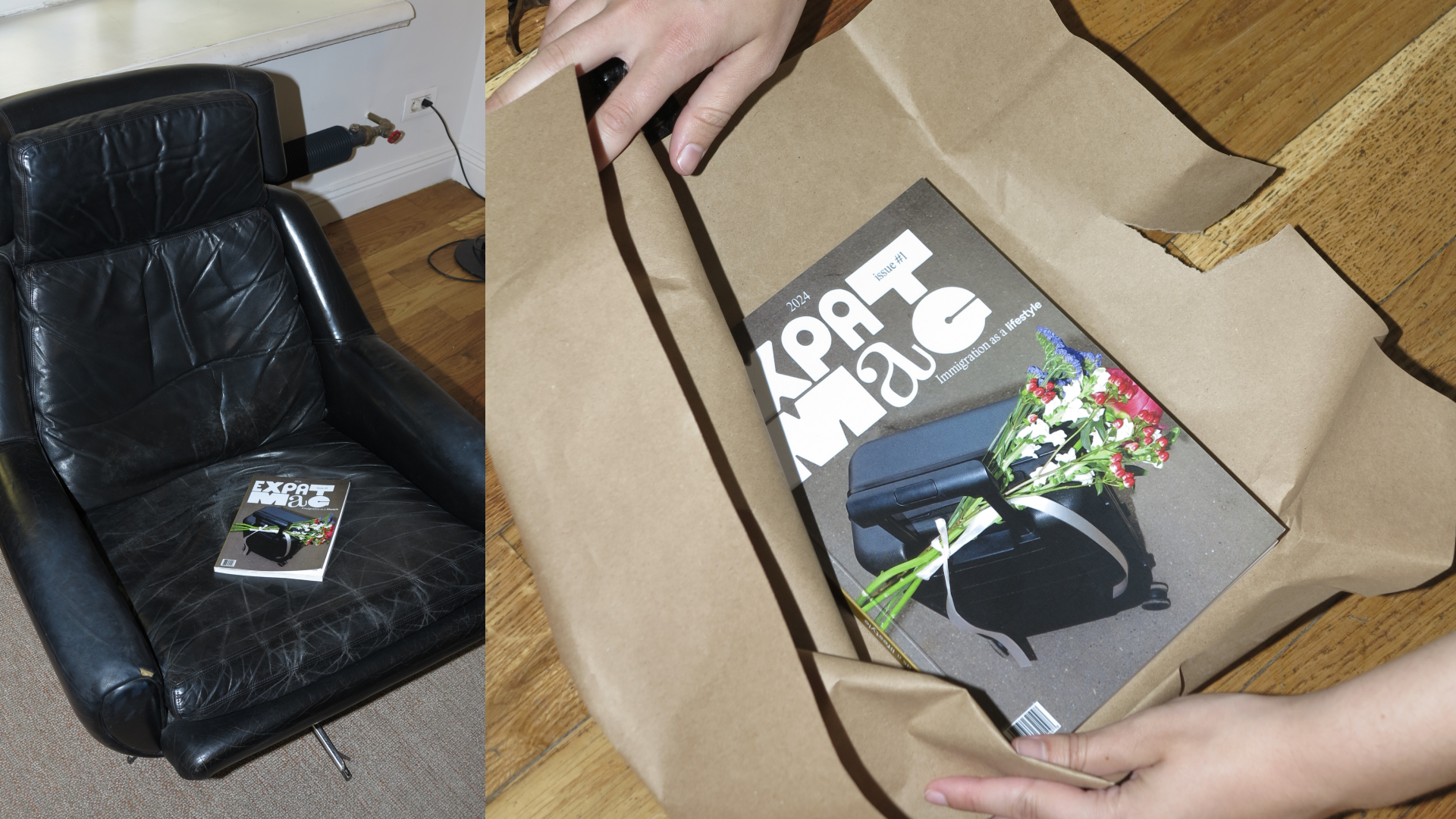
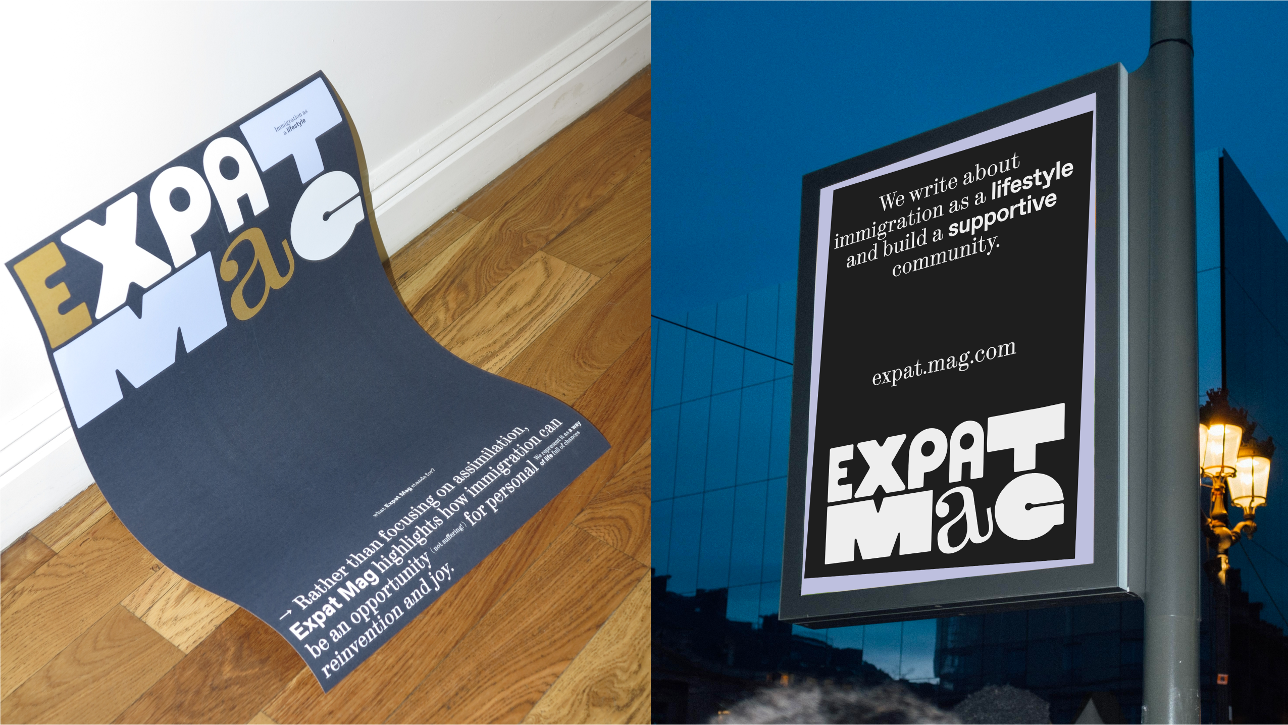
Expat Mag is an independent editorial project developed as a graduation work at HSE Art and Design School. It explores immigration as a lifestyle, not a temporary challenge, but an ongoing, open-ended way of living in a new place.
goal
The goal of the project is to shift the narrative around immigration from survival to self-expression. Rather than focusing on documentation, bureaucracy, or assimilation, Expat Mag highlights the emotional and visual side of relocation. It treats immigration as a personal journey that is confusing, rich in detail, and full of meaning — and asks: what if this experience could be seen as something beautiful?
IDEA
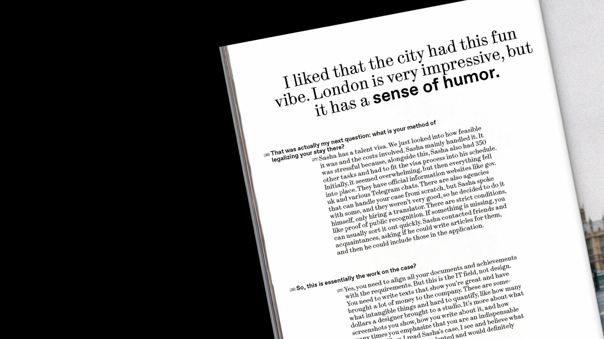
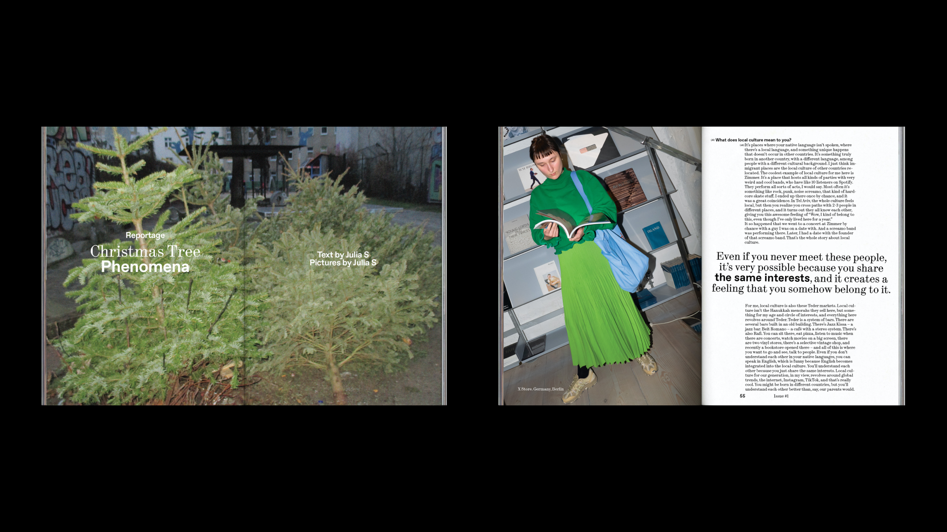
This idea shaped the visual language of the magazine. The identity is built around the metaphor of an unsettled life — text and graphic elements appear slightly off-grid, tilted or misaligned, as if still in motion. The photo style uses direct flash to capture intense, unfiltered impressions — just like the way new immigrants often perceive everything at once, without yet having internal filters. Through this aesthetic, Expat Mag reflects the instability, sensory overload, and hidden poetry of starting over.

CREDITS
Typefaces: ABC Dinamo Synt, ABC Dinamo Favorit | University: HSE ART&DESIGN SCHOOL | Tutor: Evgeny Kashirin | Interview guests: Anna Kolysheva, Milena Medvedeva, Jane Tamm | Shooting location:
Richter, Lebigmag | Photography: Julia Selezneva, with contributions by Anna Kolysheva.
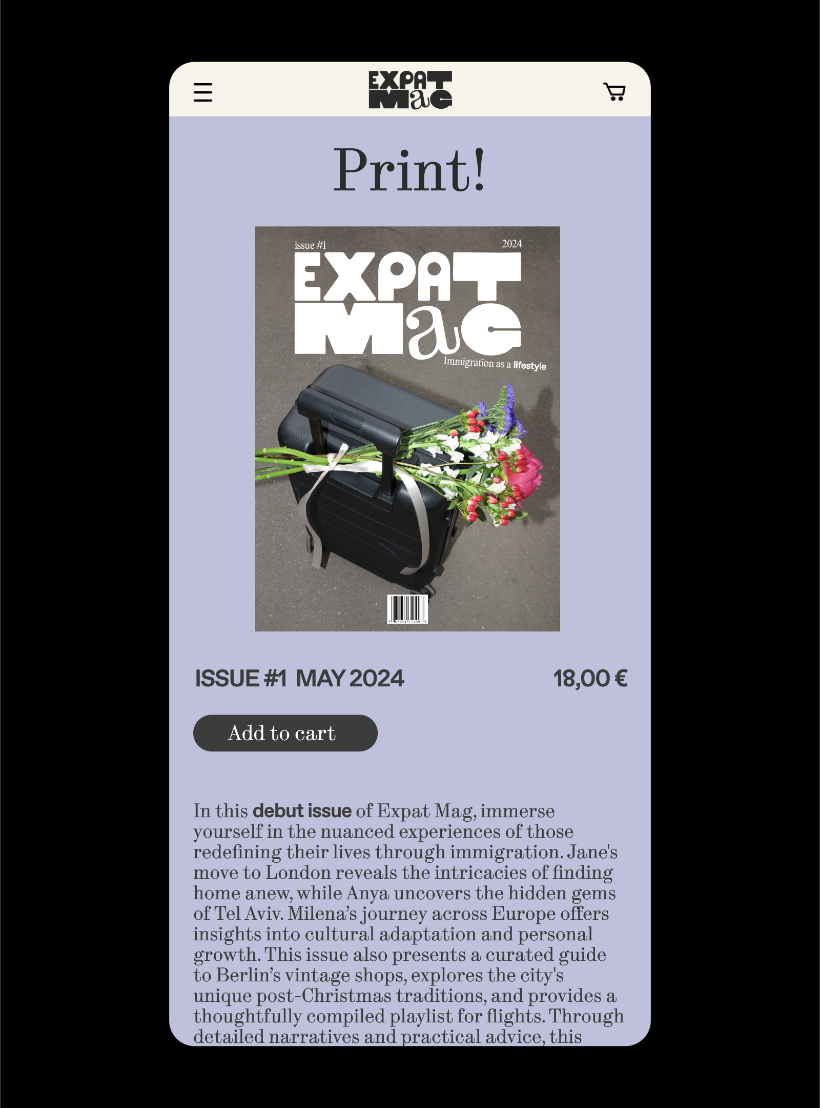
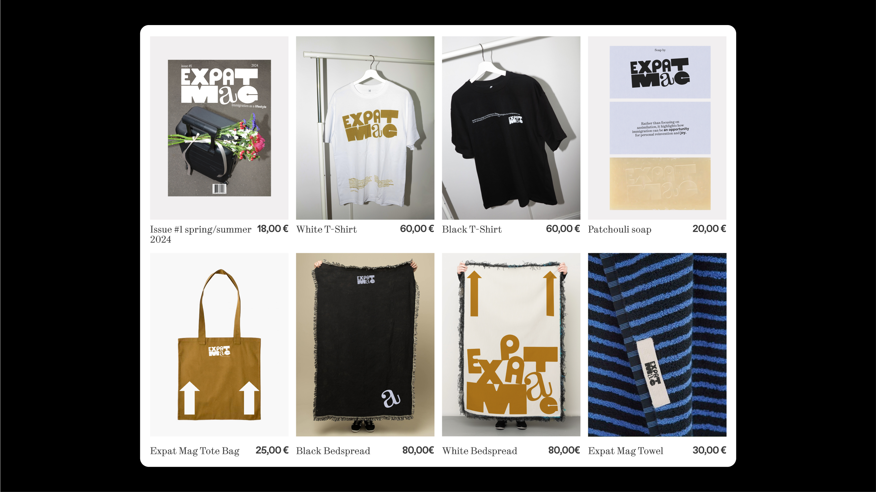
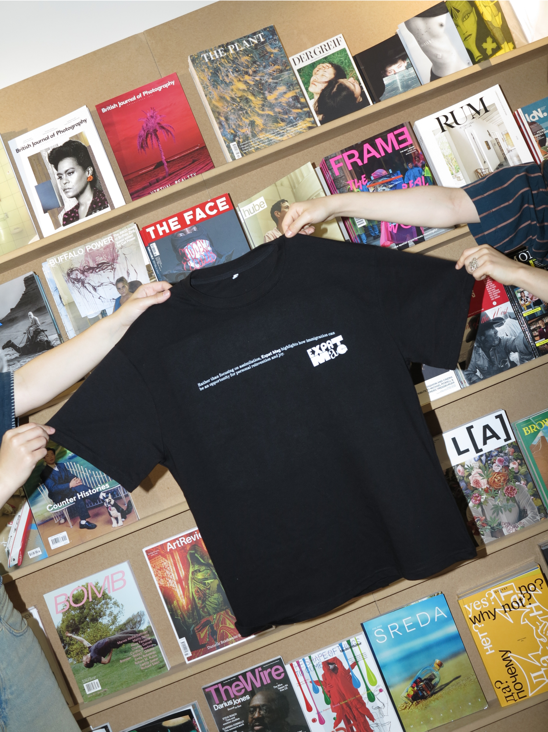
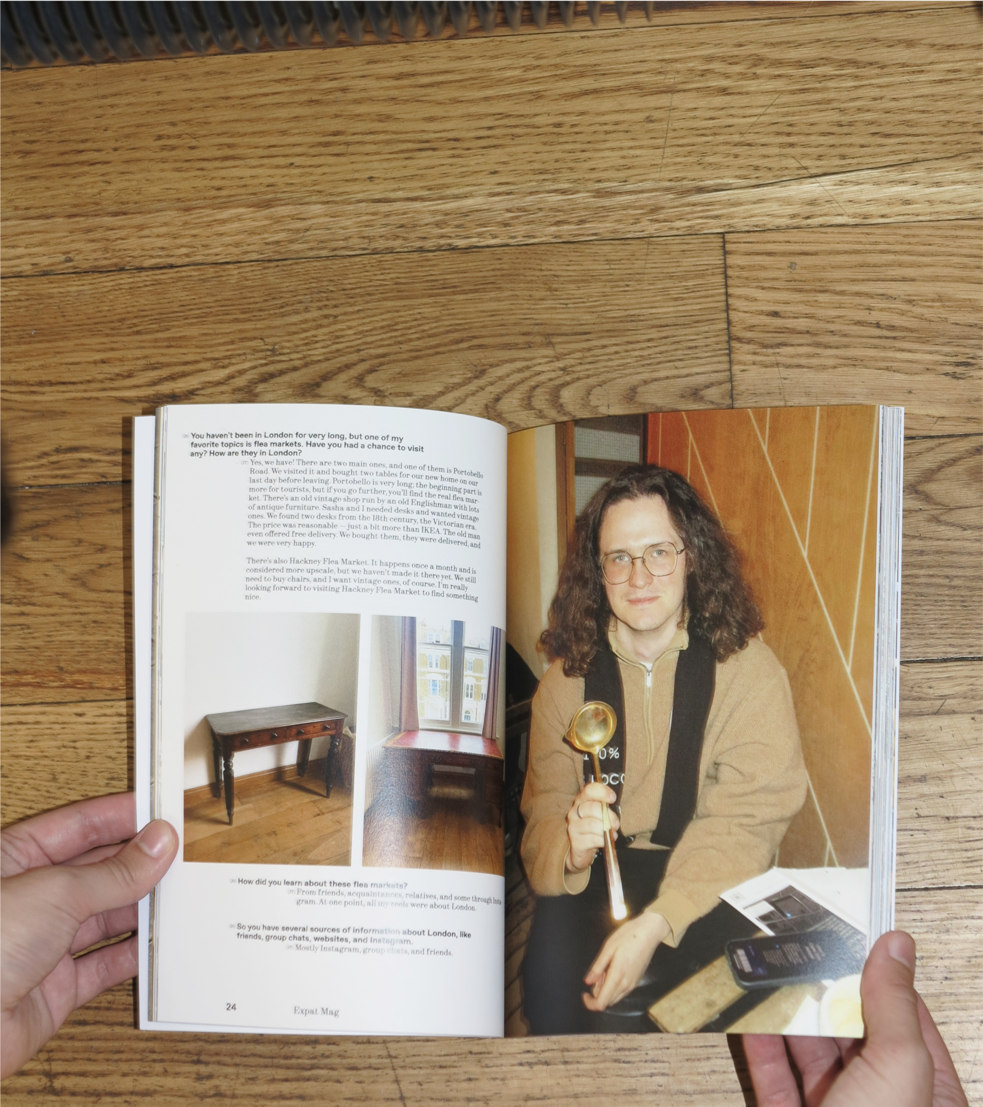
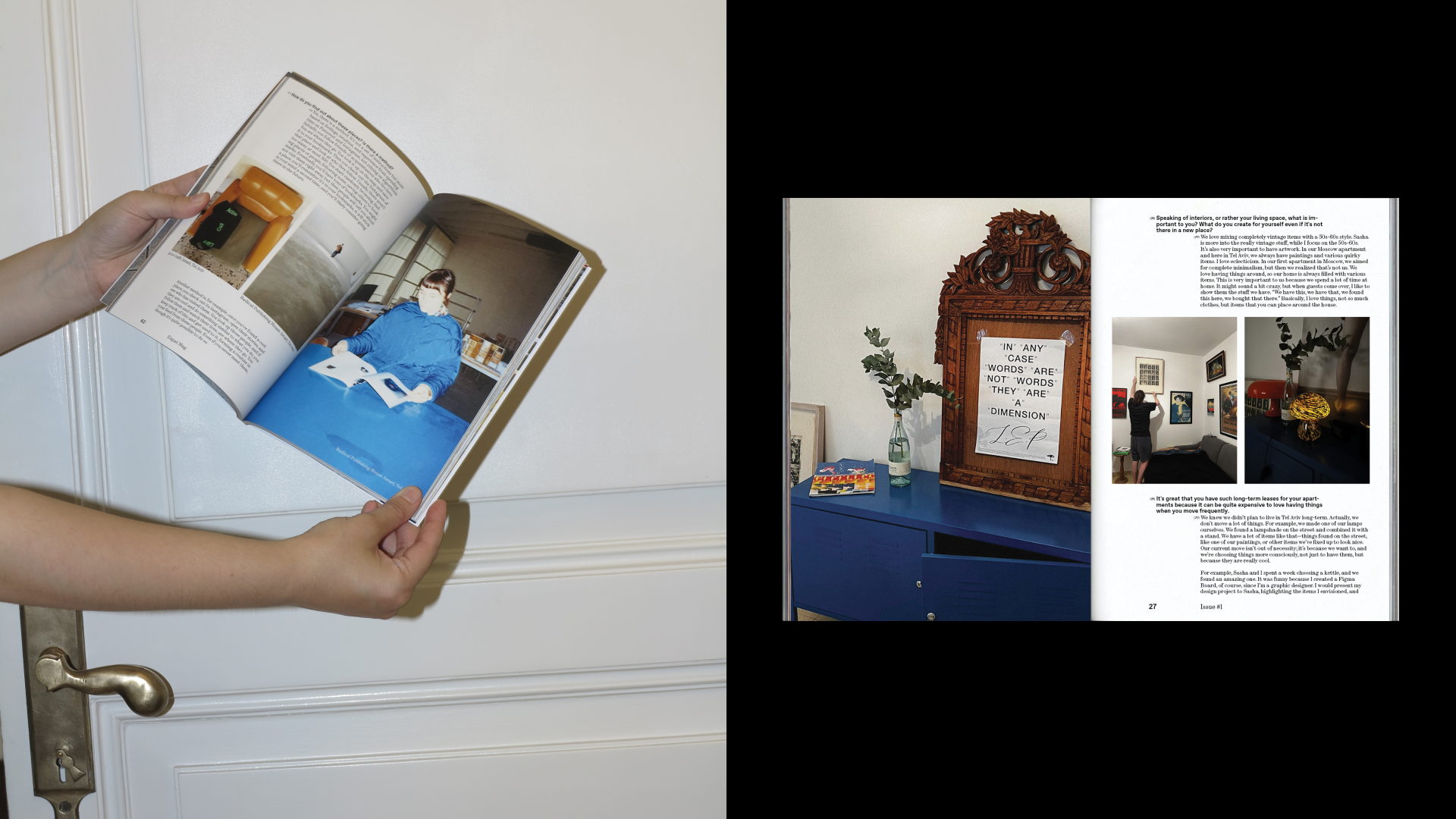
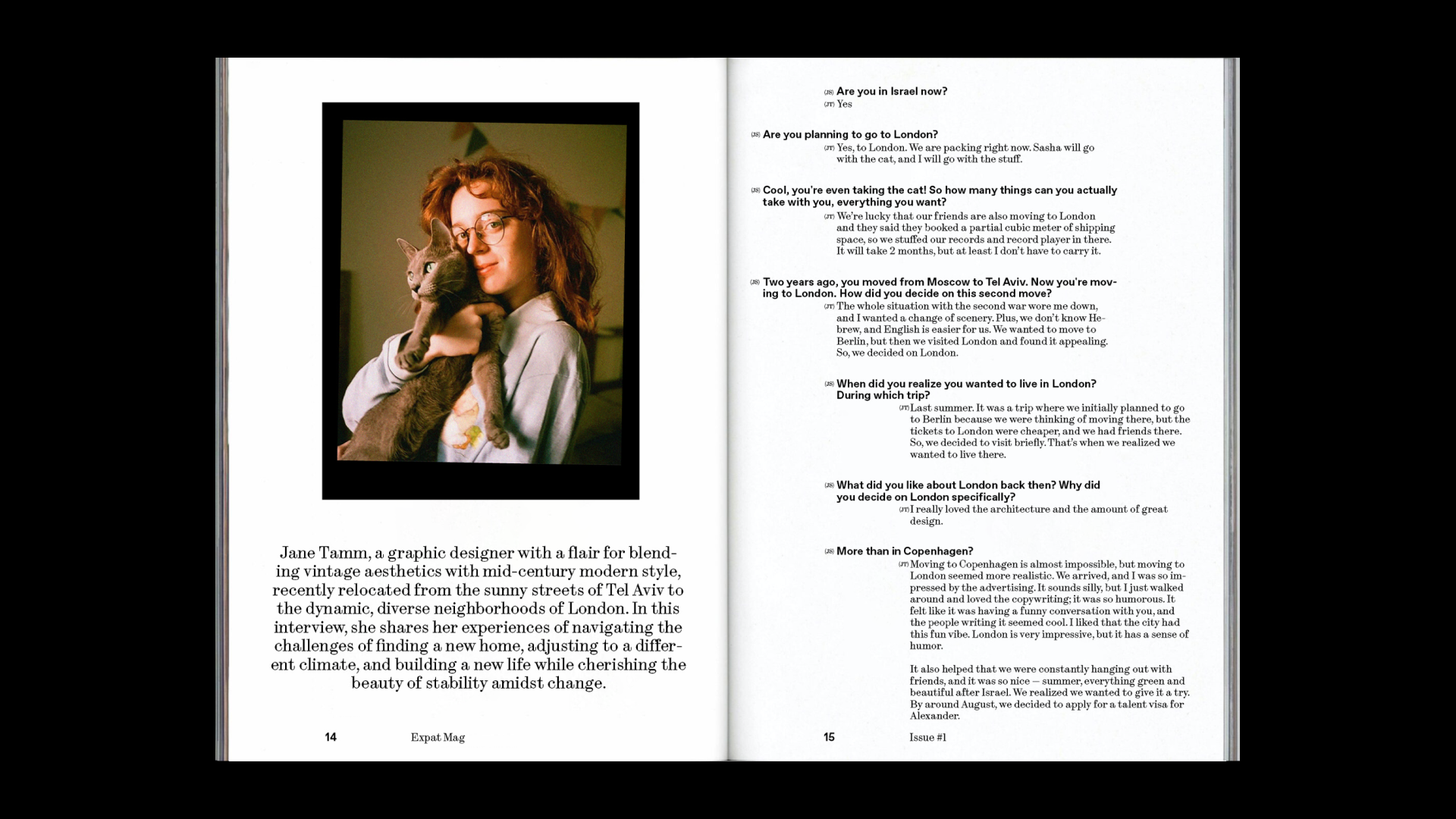
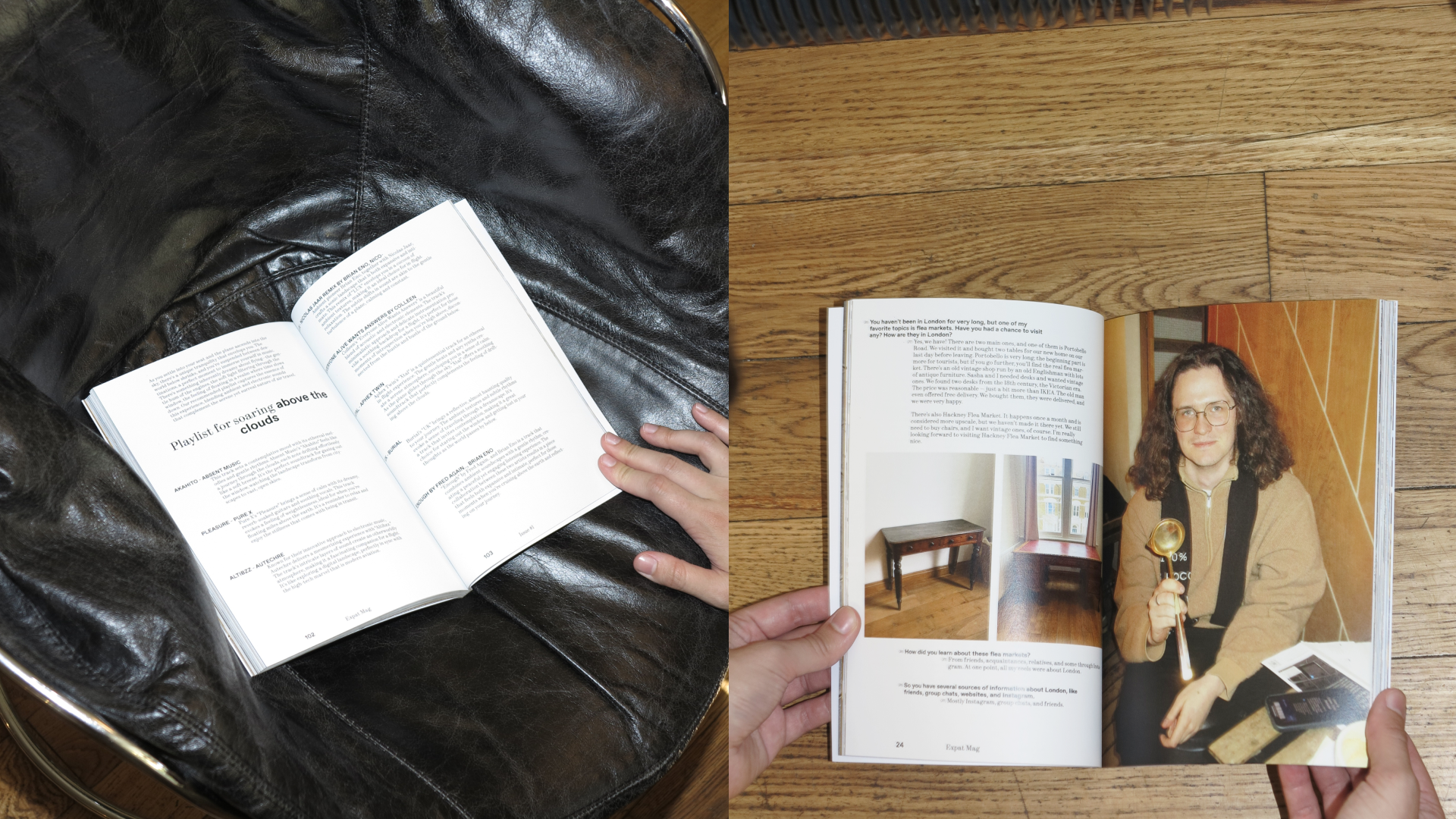
- expat mag. print
BACKGROUND
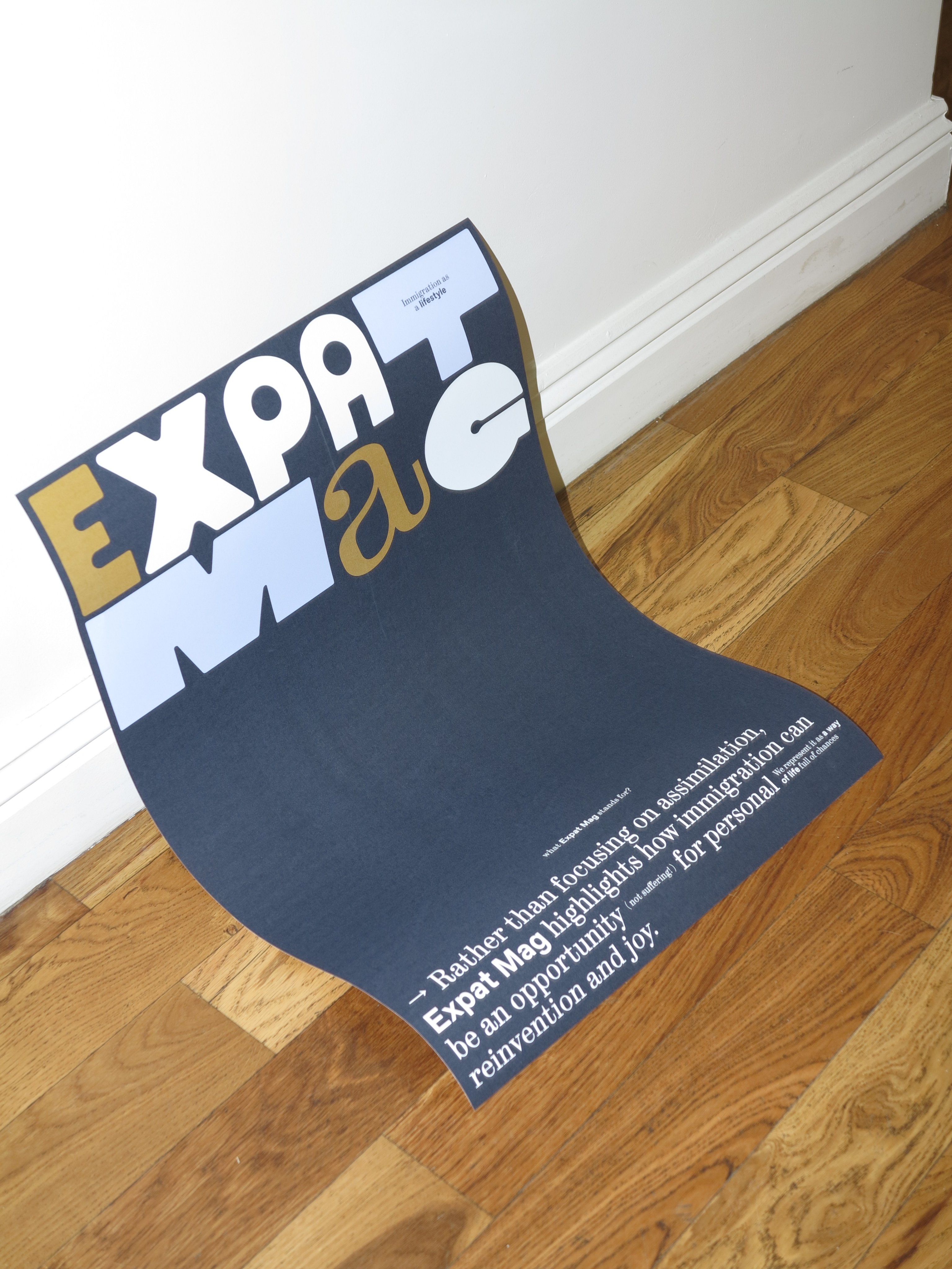
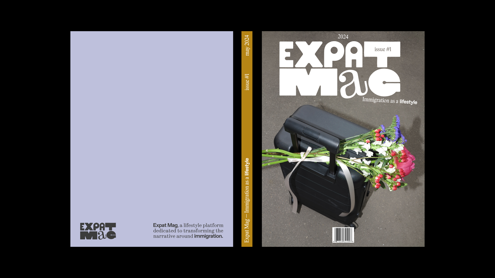
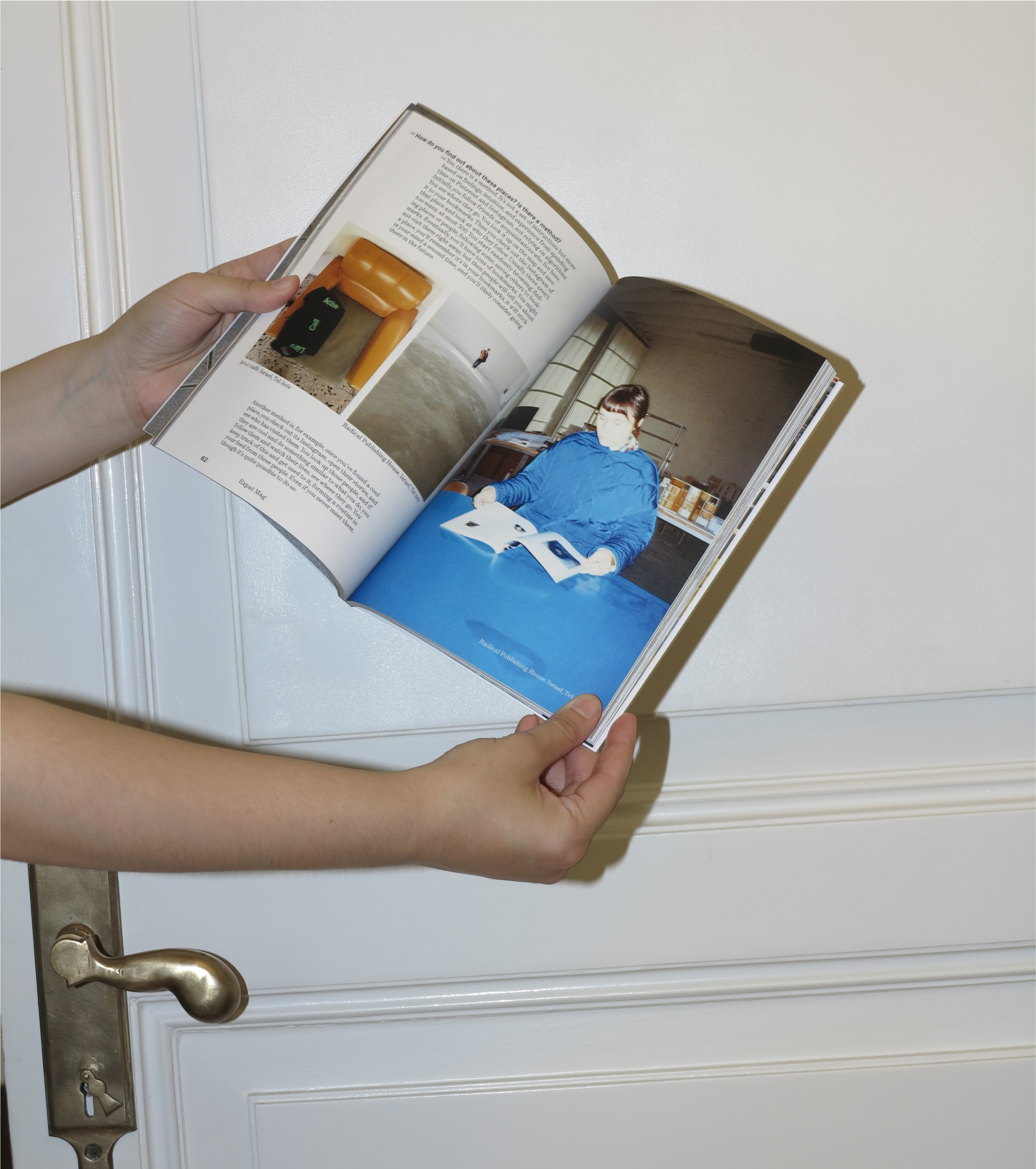
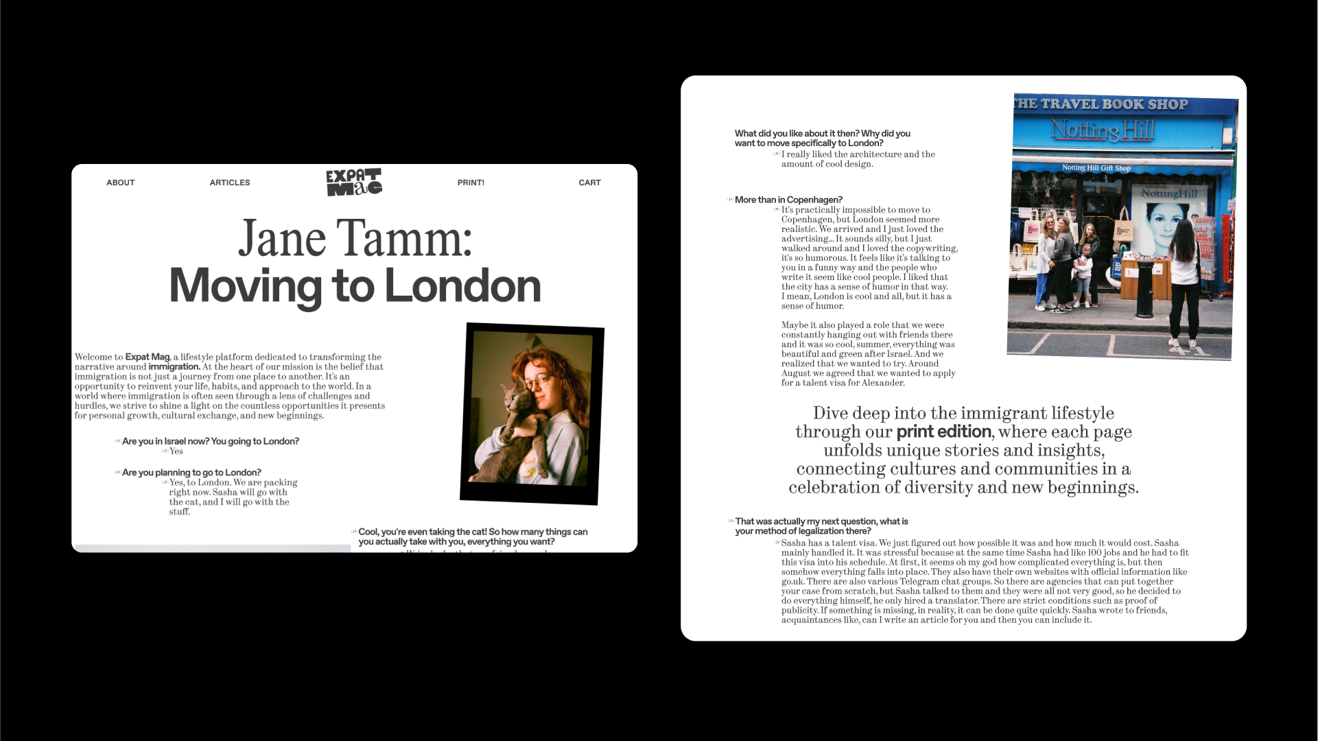
As Expat Mag was conceived as both a media brand and a publication, the visual identity naturally extends into print. The first issue of the magazine puts the concept into physical form, continuing the exploration of immigration as a lifestyle.
goal
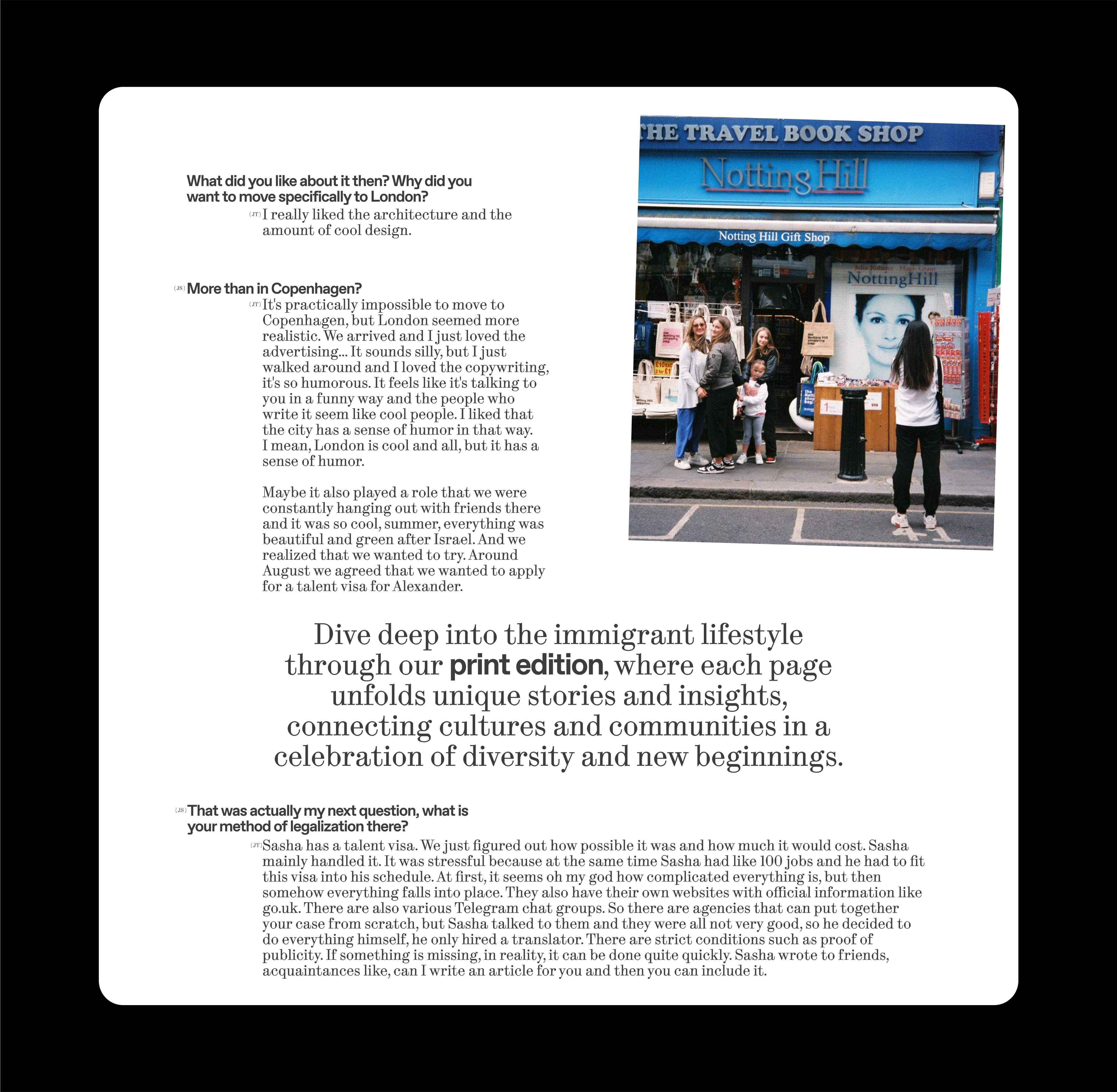
It features a collection of interviews with people who have moved abroad, sharing how immigration shapes their routines, emotions, and sense of home. Their stories are accompanied by imagery, typography, and layout choices that follow the same idea — to show the beauty and tension of life in transition.
IDEA
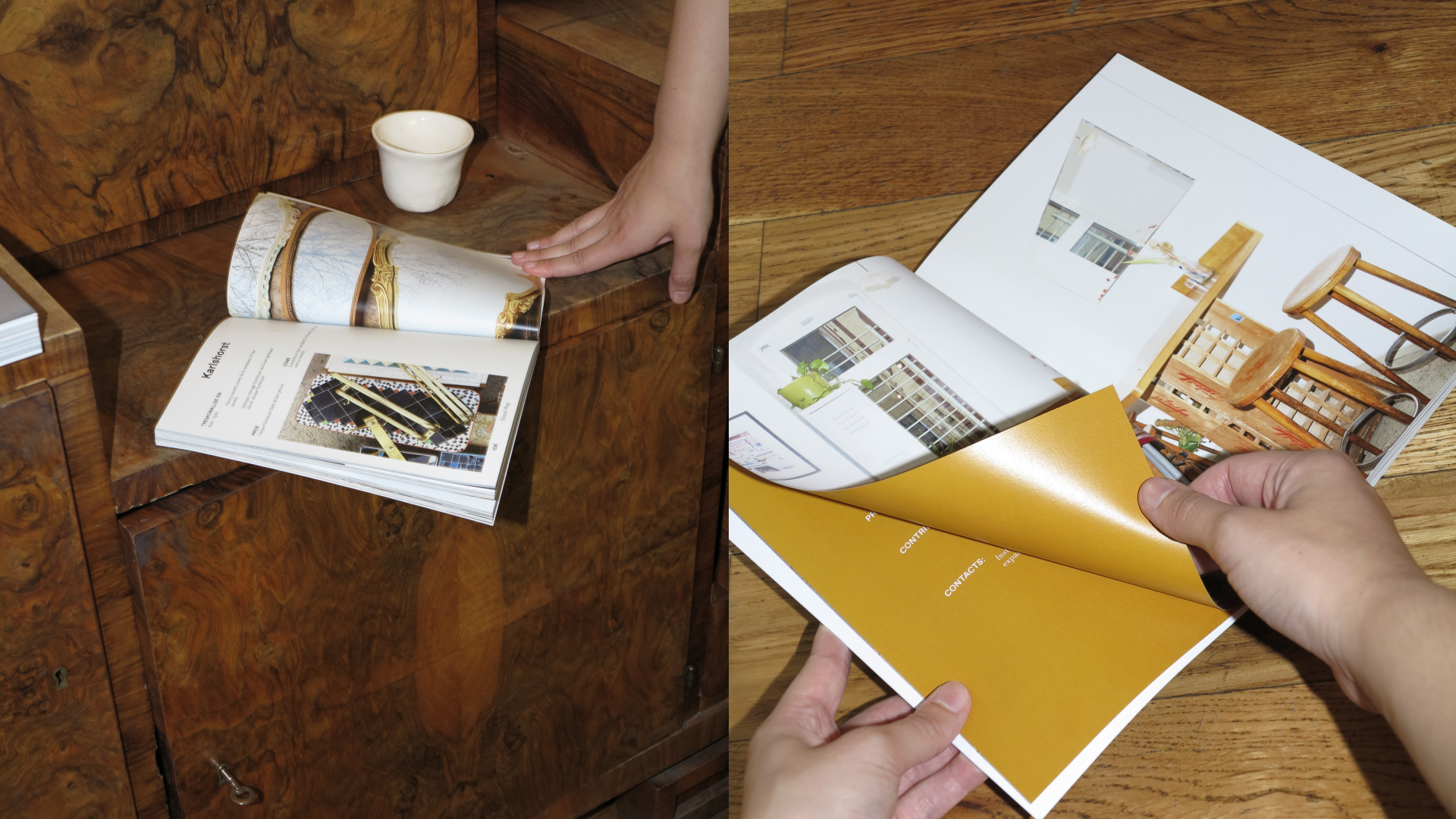
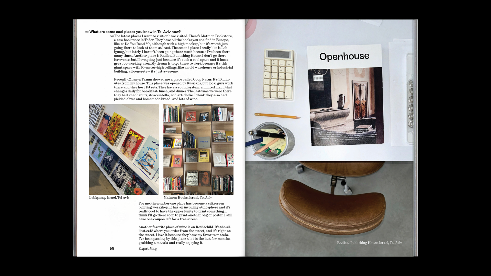
The editorial design continues the visual metaphor of something temporary and shifting. The composition avoids rigid structure: text blocks lean, image placement feels instinctive, and spacing varies across spreads. These decisions echo the experience of adjusting to a new environment — when things feel slightly off, but full of presence and sensitivity.
CREDITS
Typefaces: ABC Dinamo Synt, ABC Dinamo Favorit | University: HSE ART&DESIGN SCHOOL | Interview guests: Anna Kolysheva, Milena Medvedeva, Jane Tamm | Printing house: Мастерская PRO.ЩЕ |Shooting location: Richter, Lebigmag | Photography: Julia Selezneva, with contributions by Anna Kolysheva
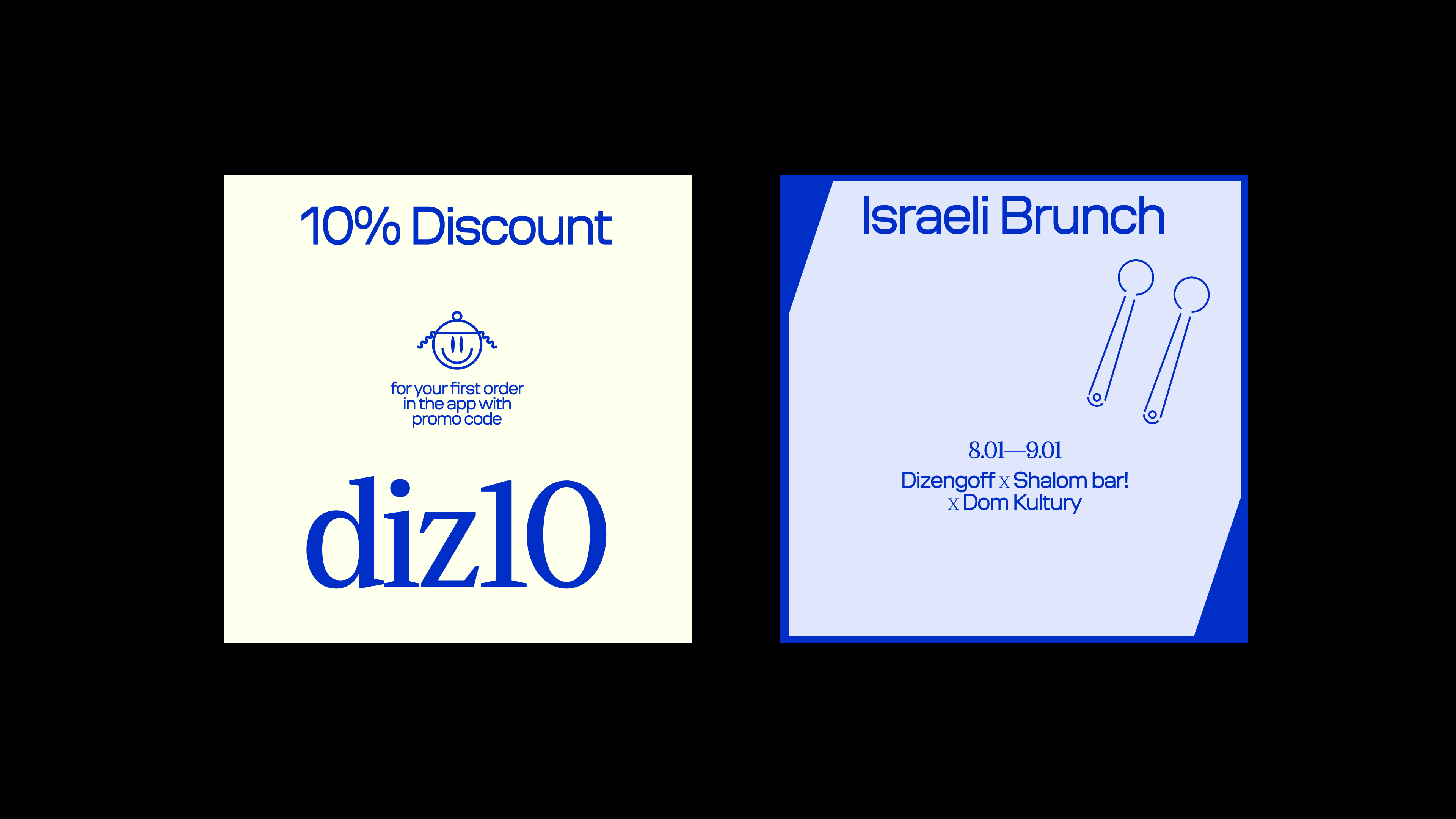
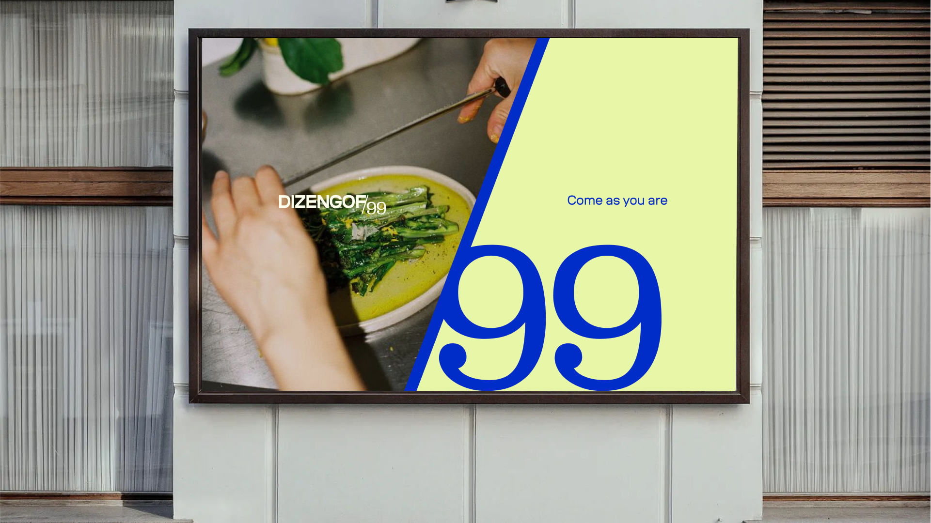
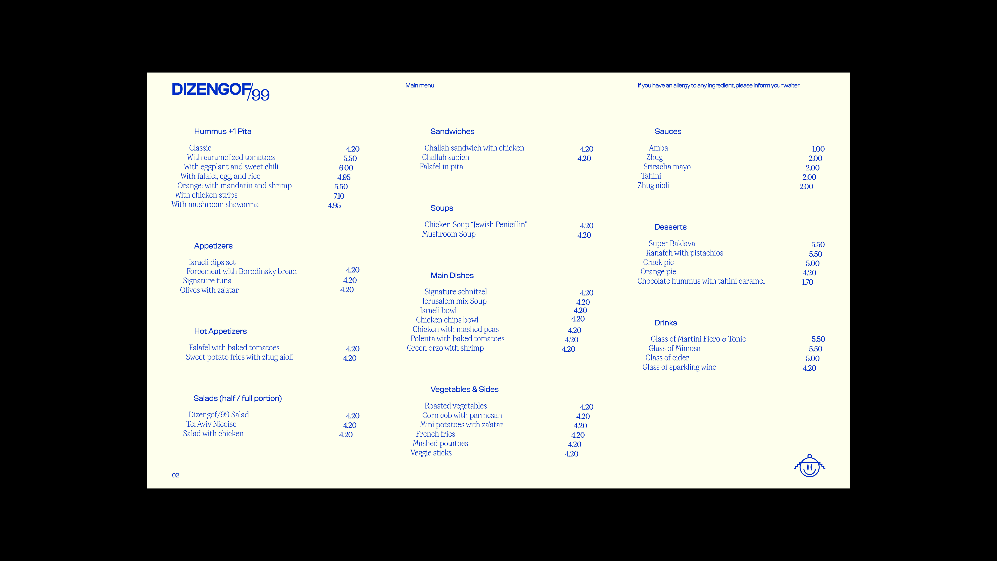
- dizengof/99
BACKGROUND
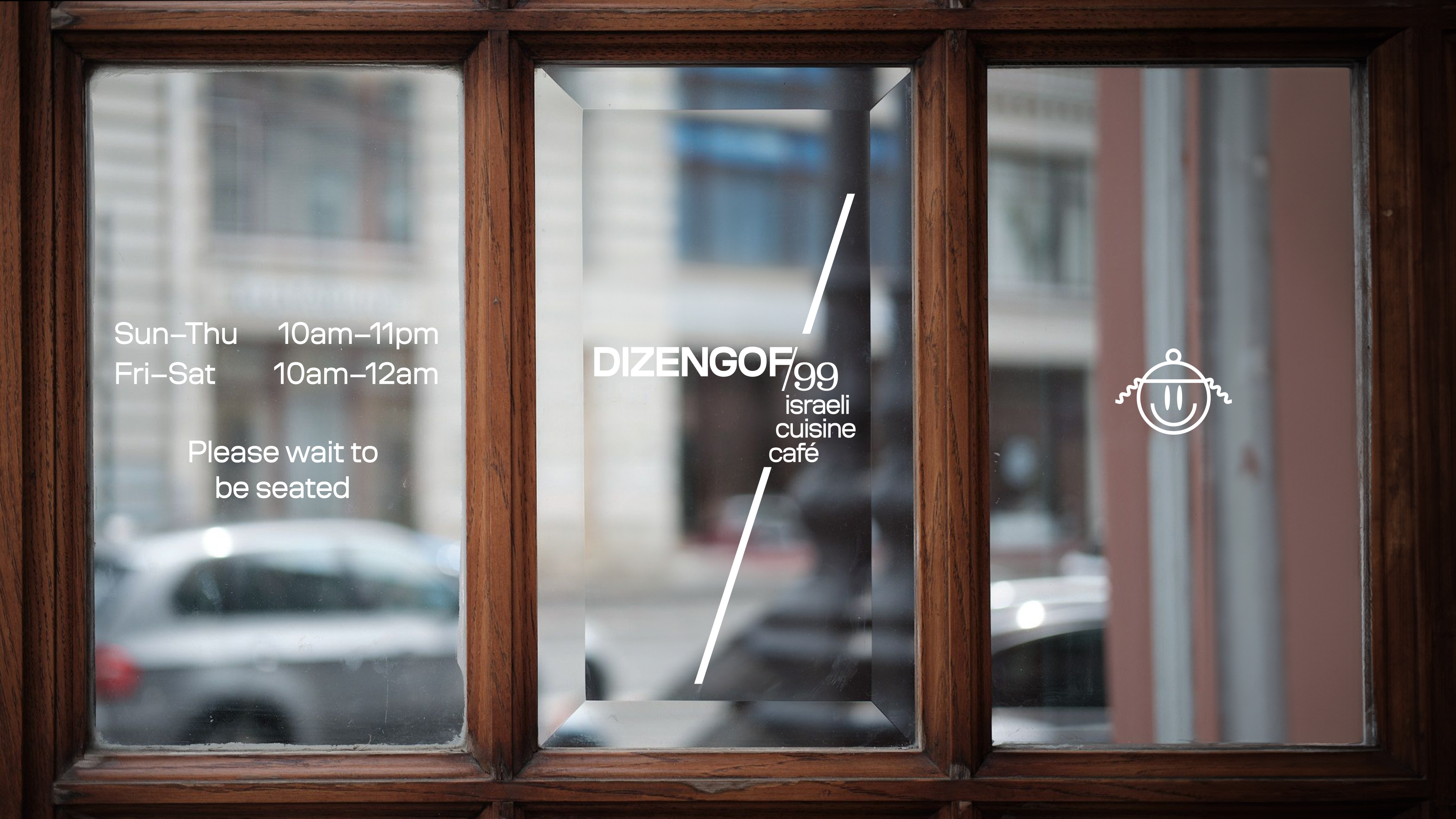
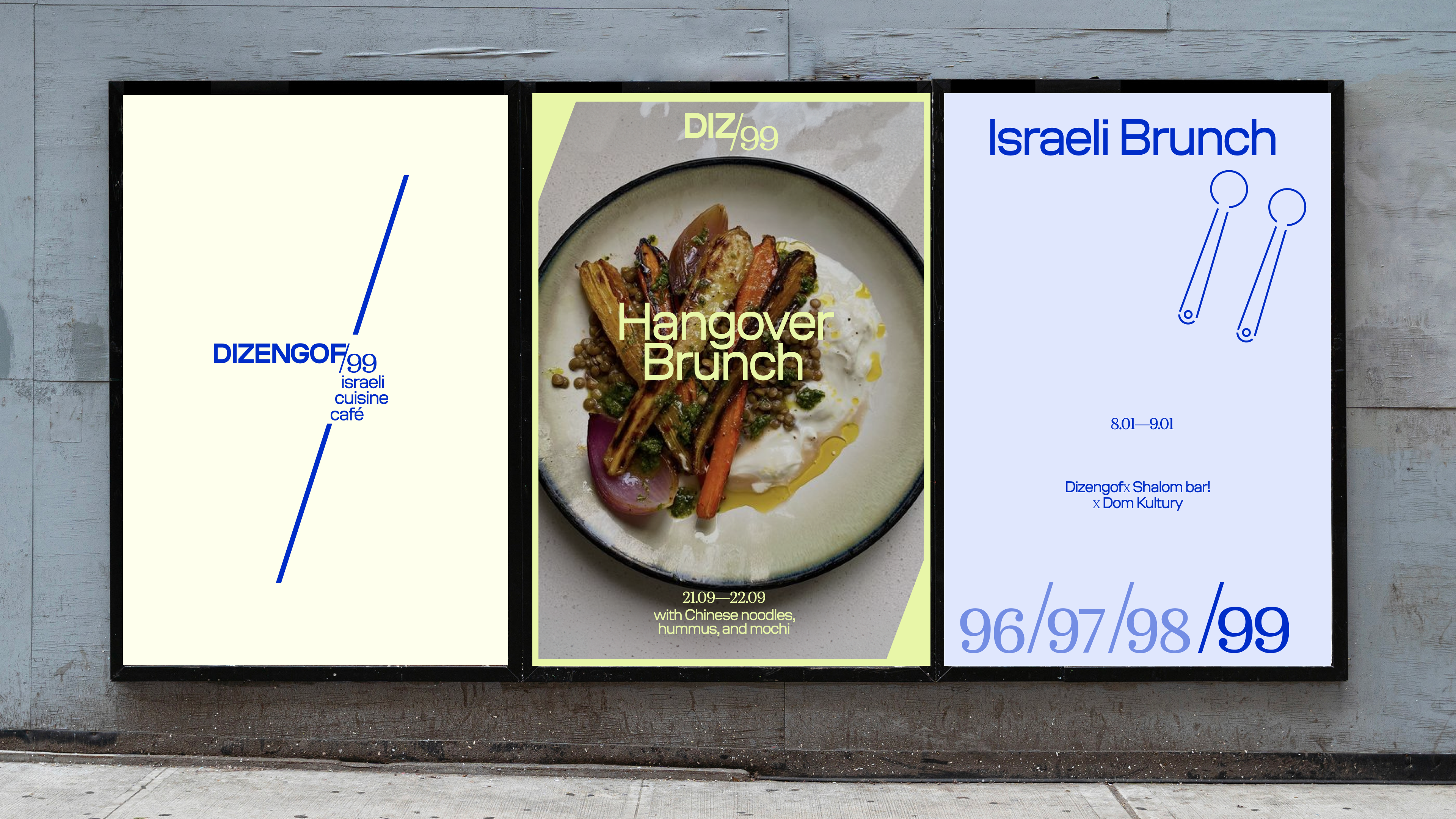
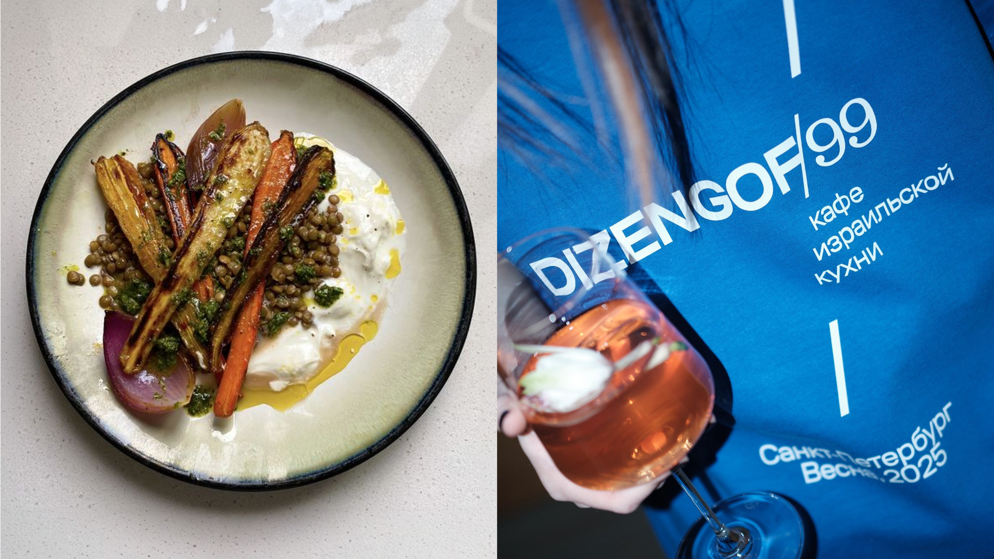
Dizengof/99 is a branding concept for an Israeli restaurant in the center of Moscow, developed as part of a client project at Tuman Studio.
goal
Working with an existing logo, the goal was to build a new visual system that would respect the original identity while expanding its expressive potential.
IDEA
The concept draws inspiration from the slash (/) in the restaurant’s logo — a reference to Dizengoff Street in Tel Aviv. This diagonal line became the key graphic element across the style. It shapes the structure of illustrations, which are built with simple, stroke-based forms, and influences the layout of all materials. Even the physical formats echo the theme, with corners cut at an angle to reflect the slash and create a strong visual rhythm throughout the brand.
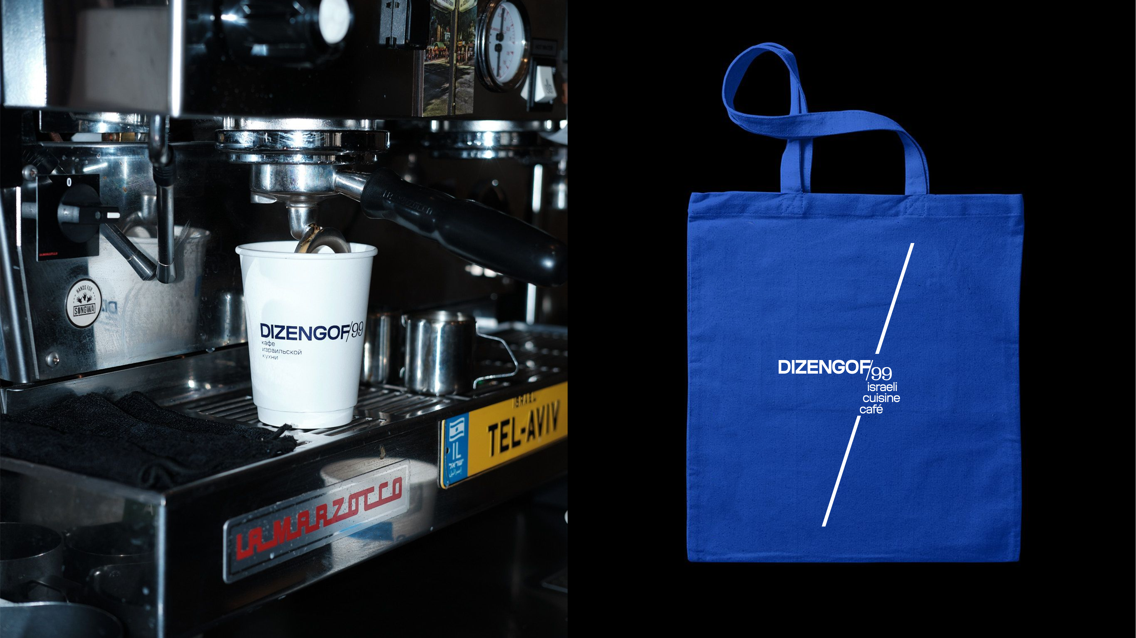
CREDITS
Developed as a personal concept at Tuman Studio | Typefaces: Coil, Maregraphe Text | Photography: Elena Gavrilenko, Julia Romanova
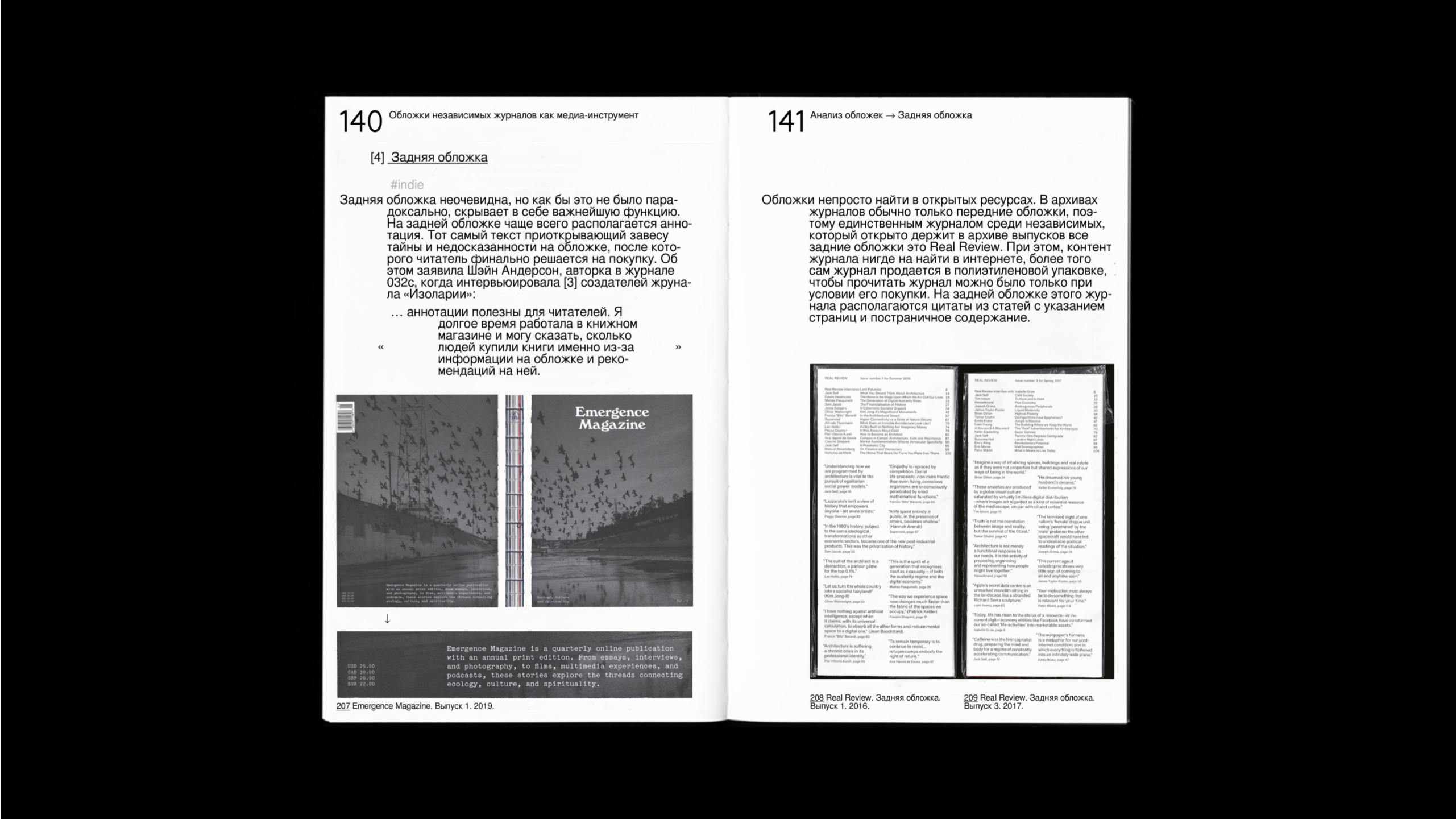
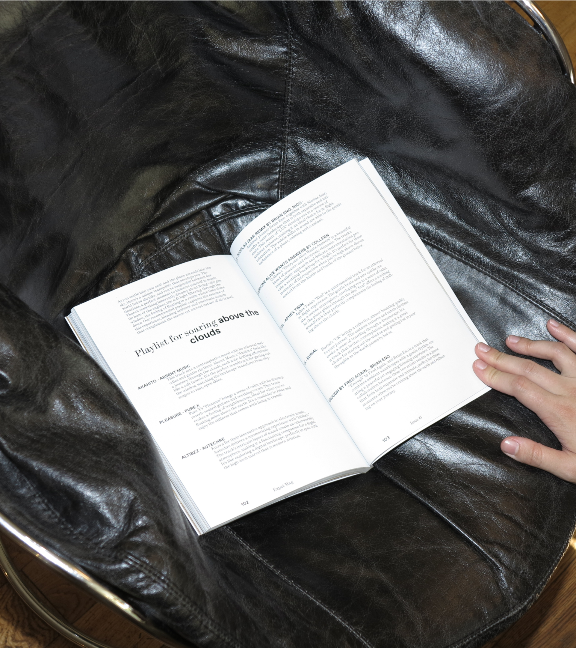
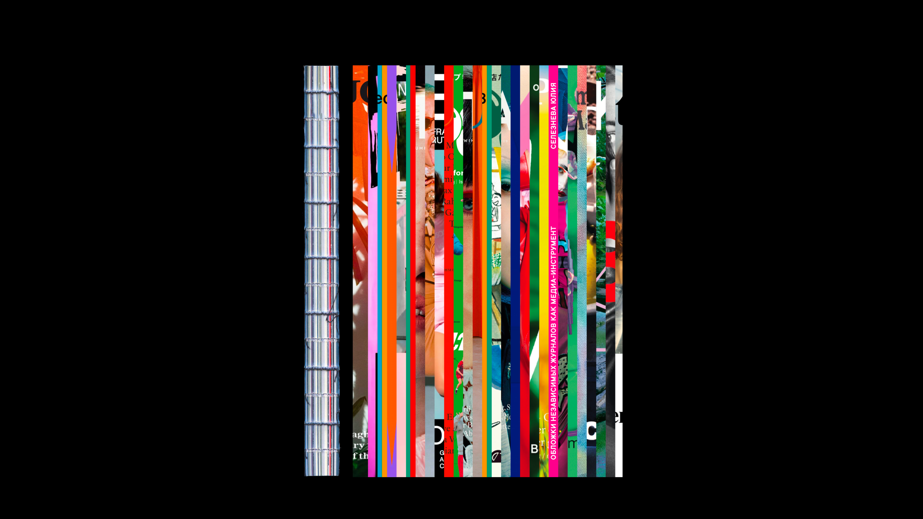
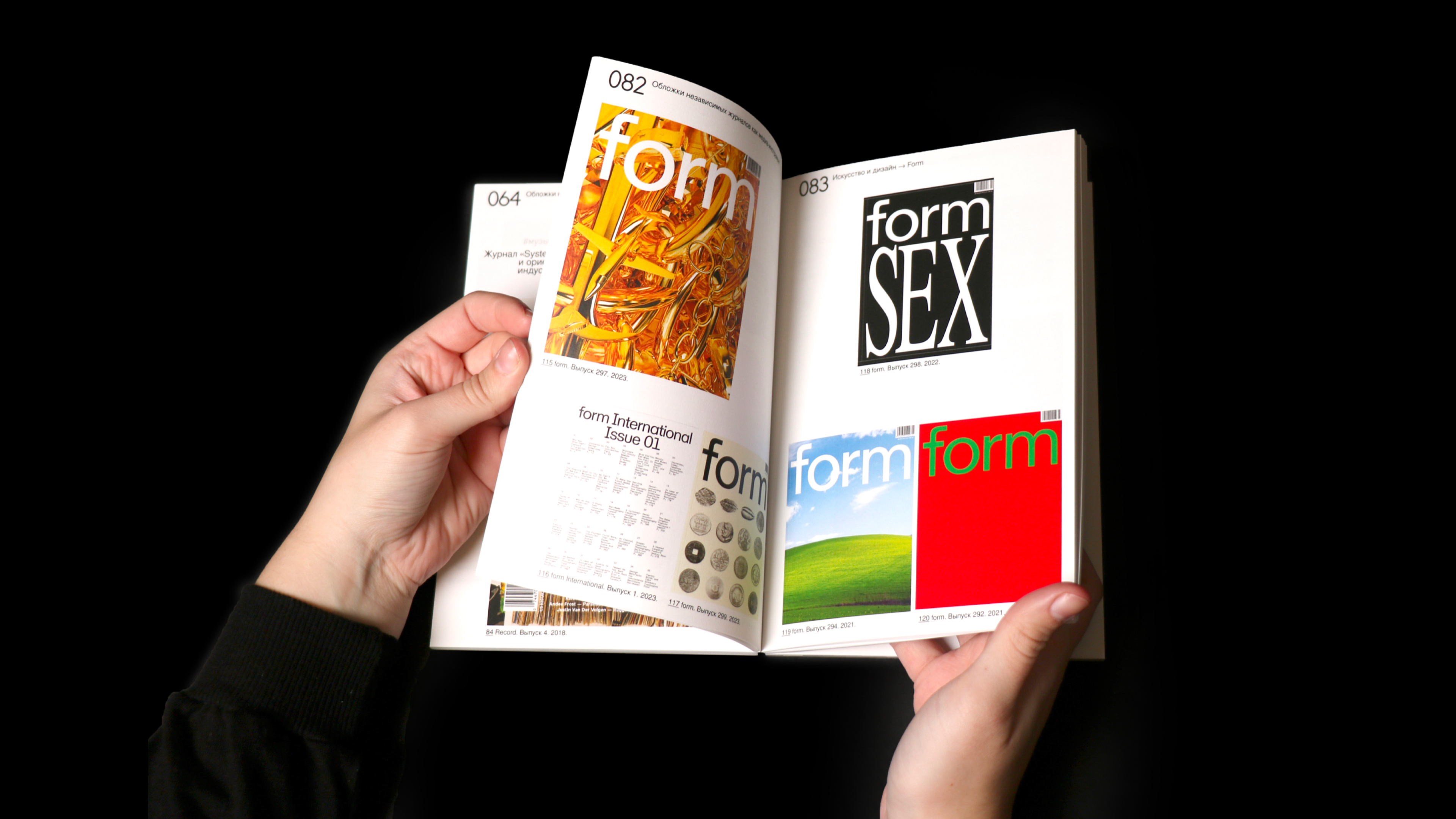
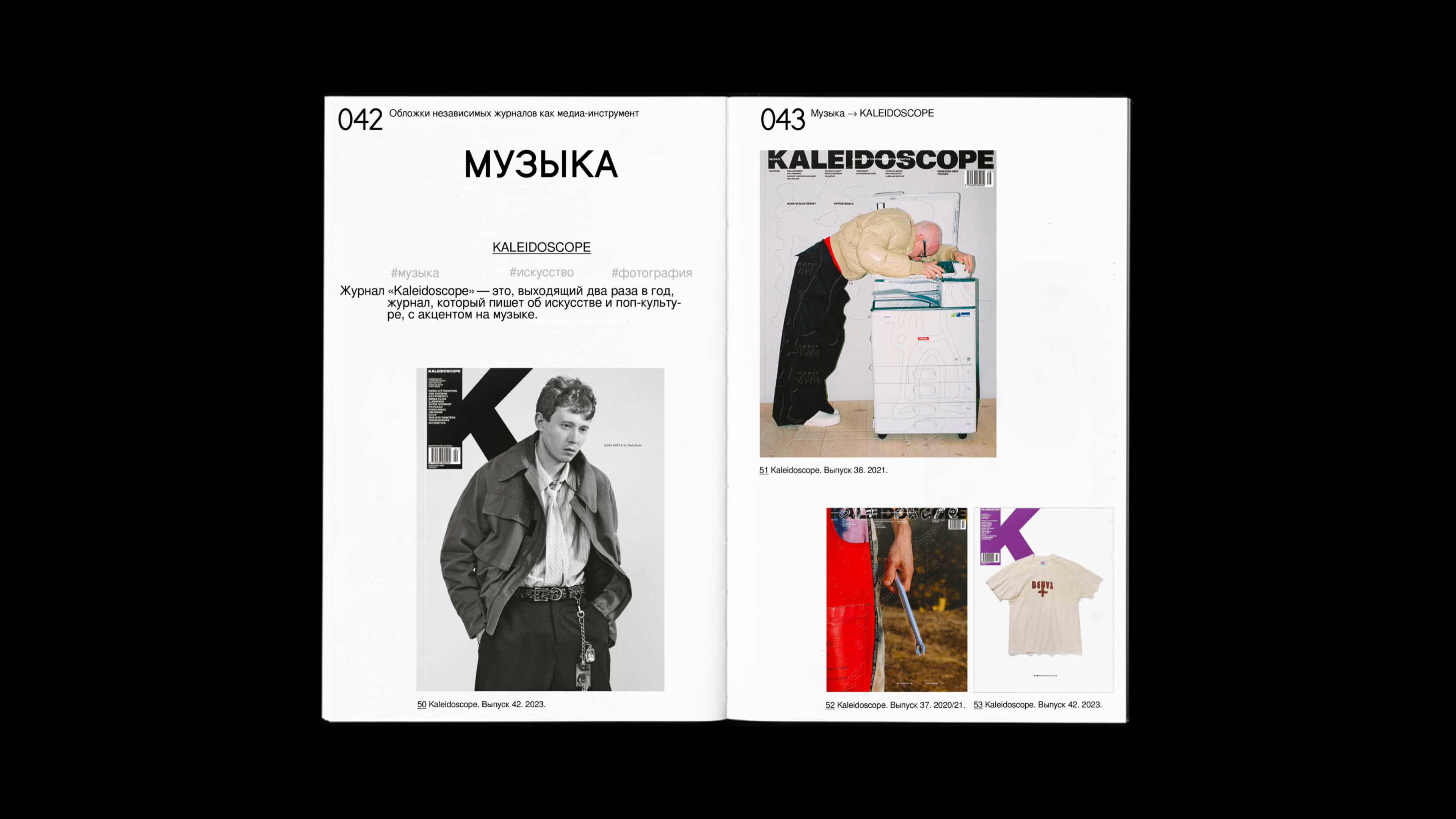
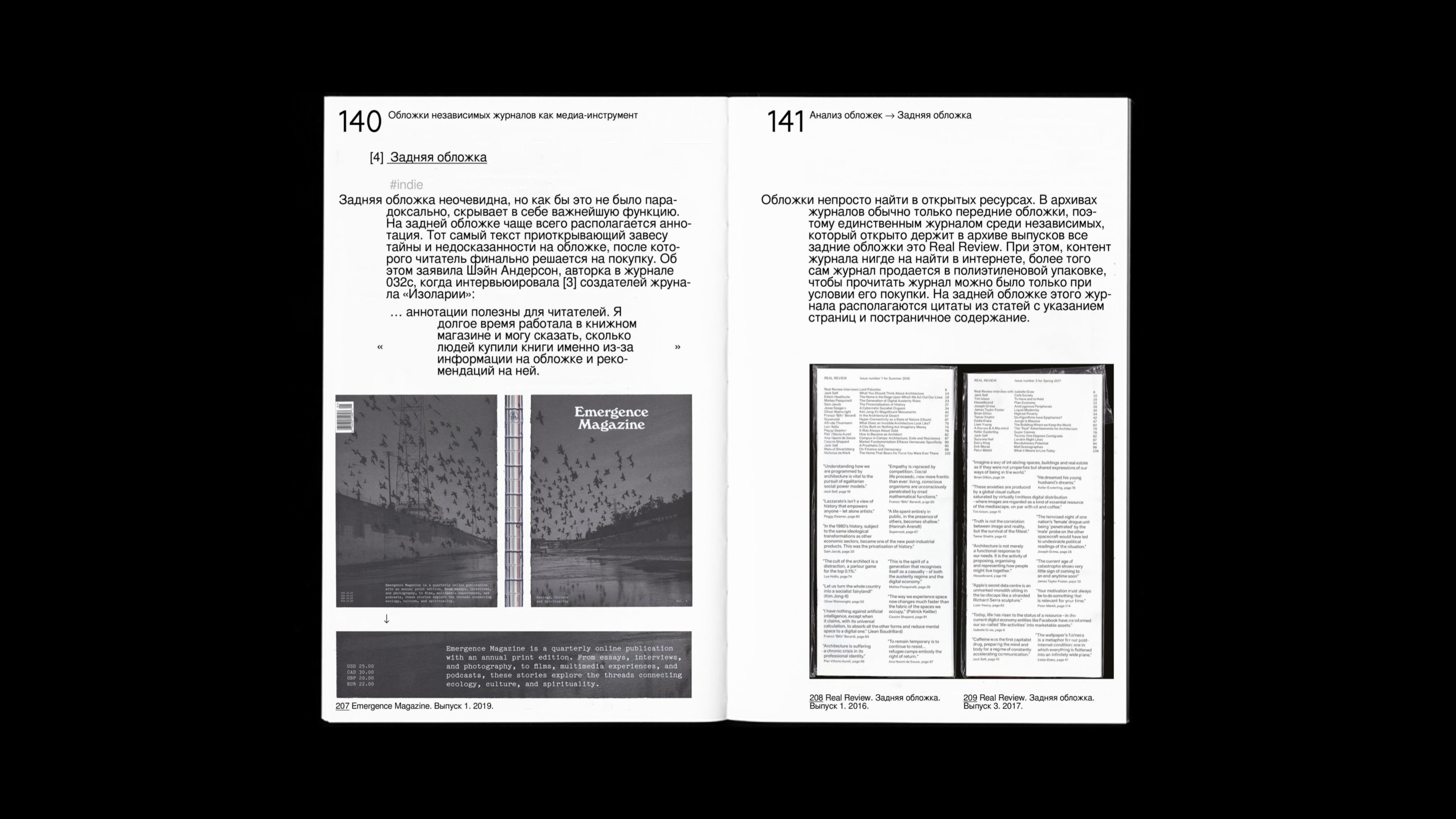
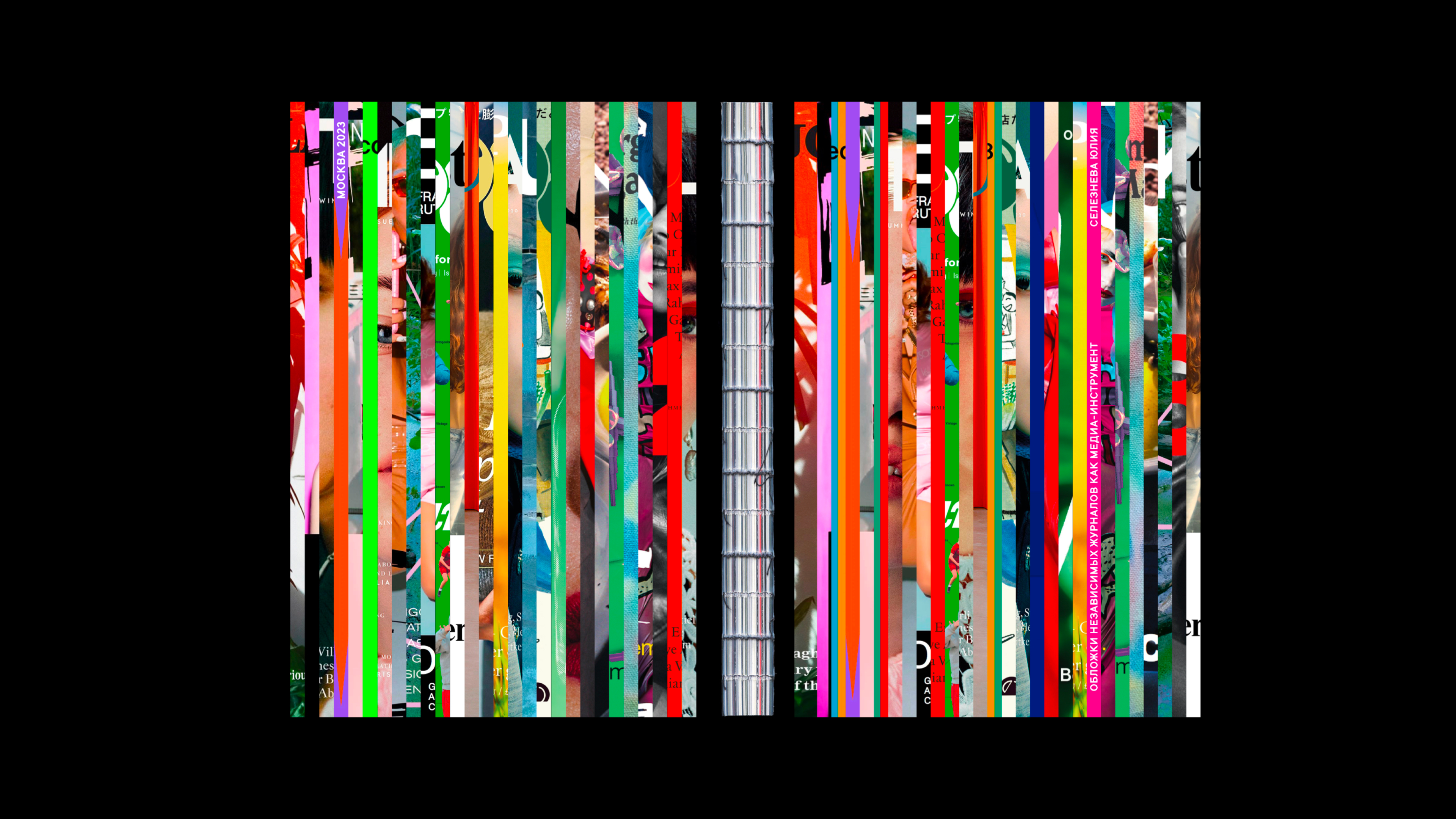
- visual research: Independent Magazines as a Media Tool
BACKGROUND
Covers of Independent Magazines as a Media Tool is a student research project developed as part of the diploma preparation at HSE Art and Design School.
goal
Since the main diploma project focused on creating a media platform and a print magazine, this study served as a foundation for understanding the visual and structural logic of independent editorial design.
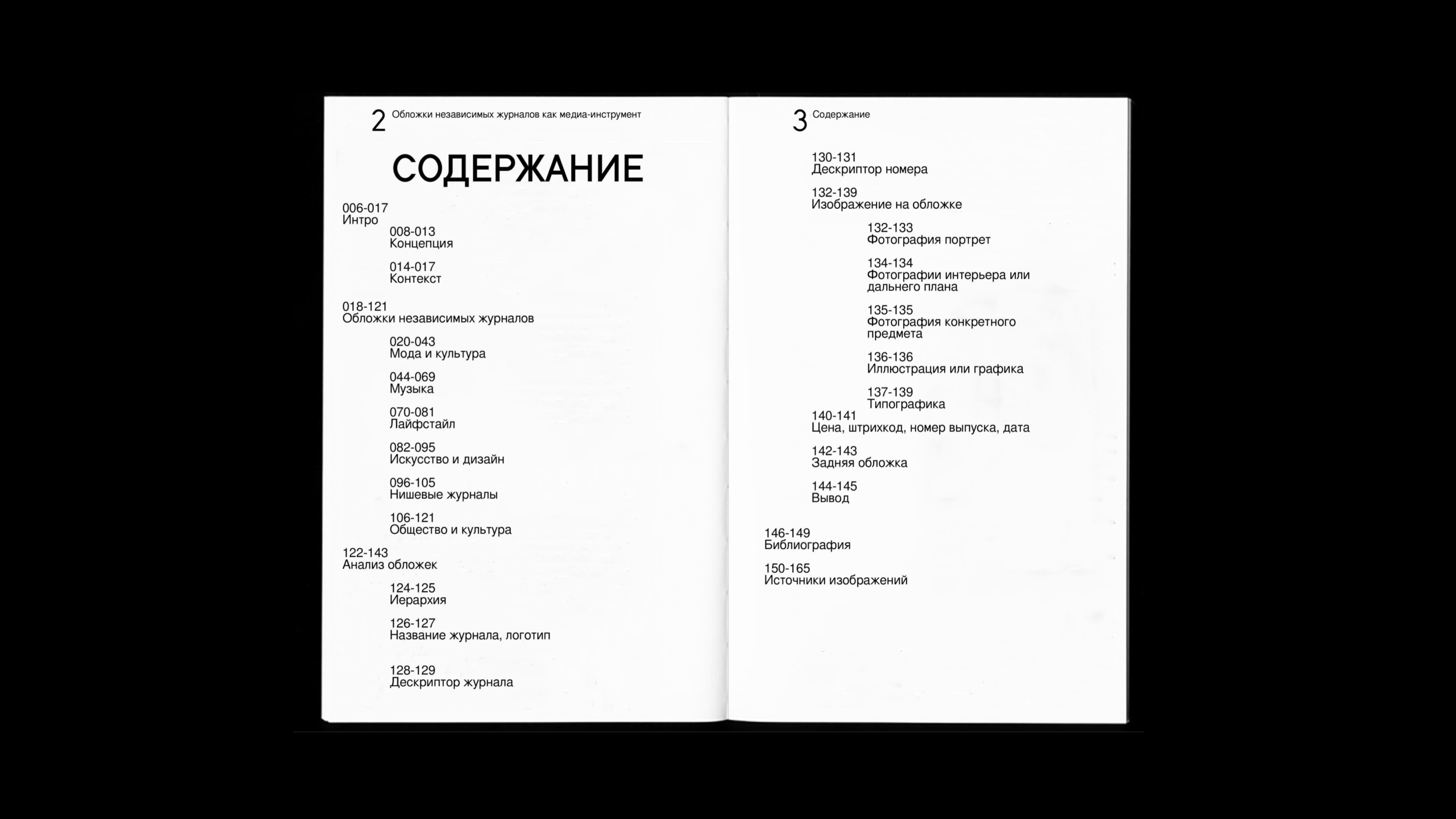
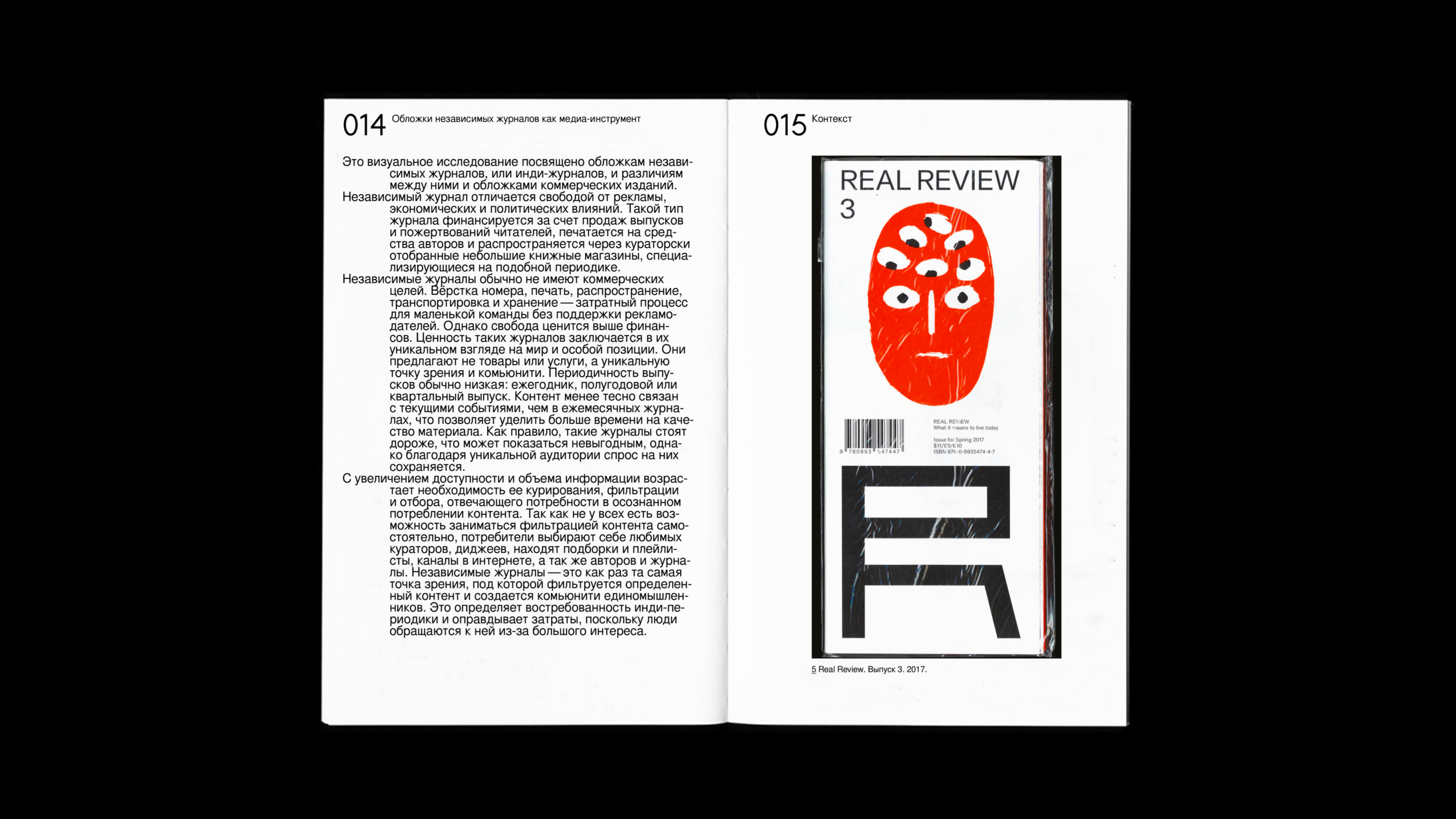
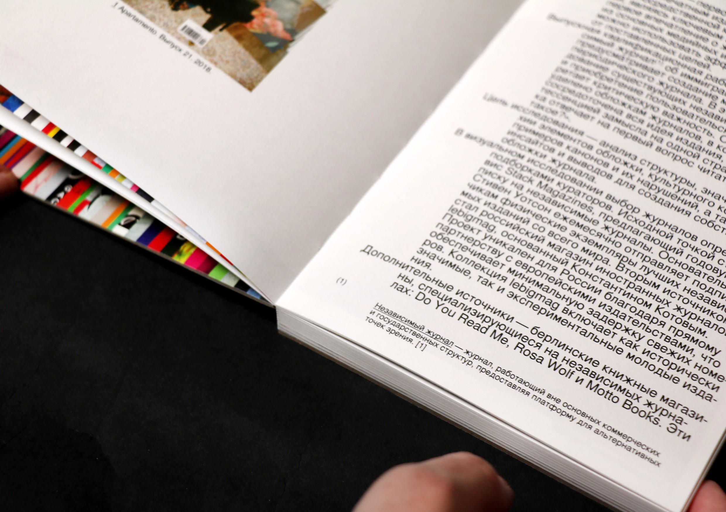
IDEA
The research analyzes how covers of indie magazines function not only as branding tools, but also as visual statements and curatorial surfaces. The study explores structure, hierarchy, imagery, and typography across various genres — from fashion and culture to niche and art publications. The material is presented in the form of a book; its cover is composed of fragments from existing magazine covers, visually reflecting the layered, referential nature of the subject itself.
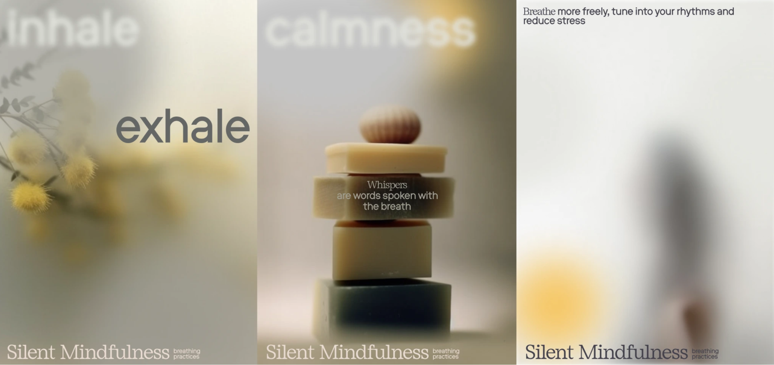
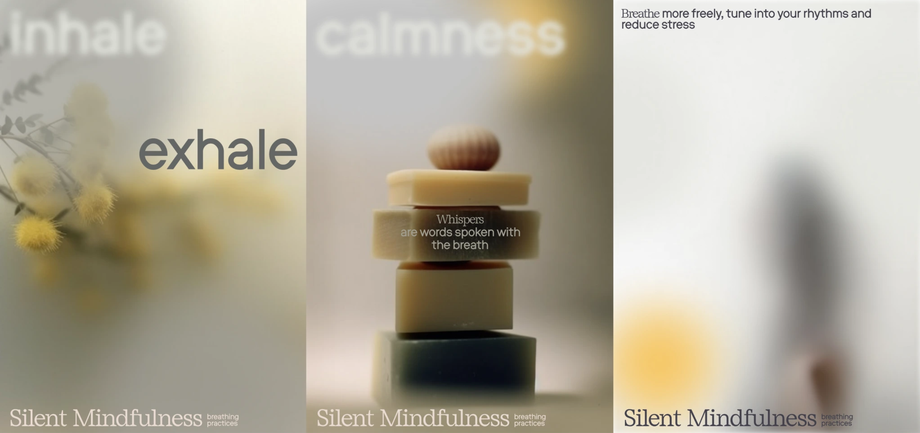
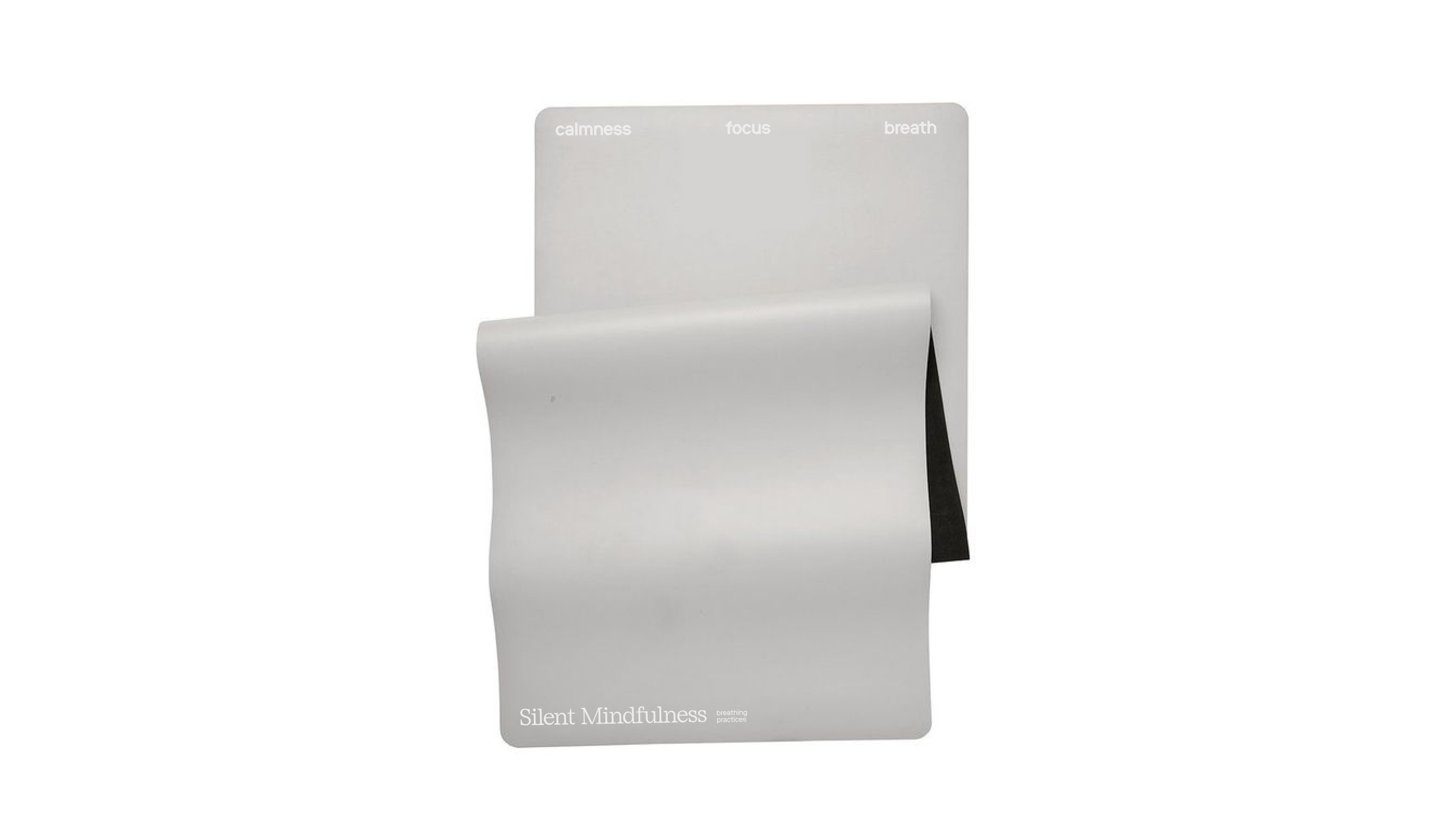
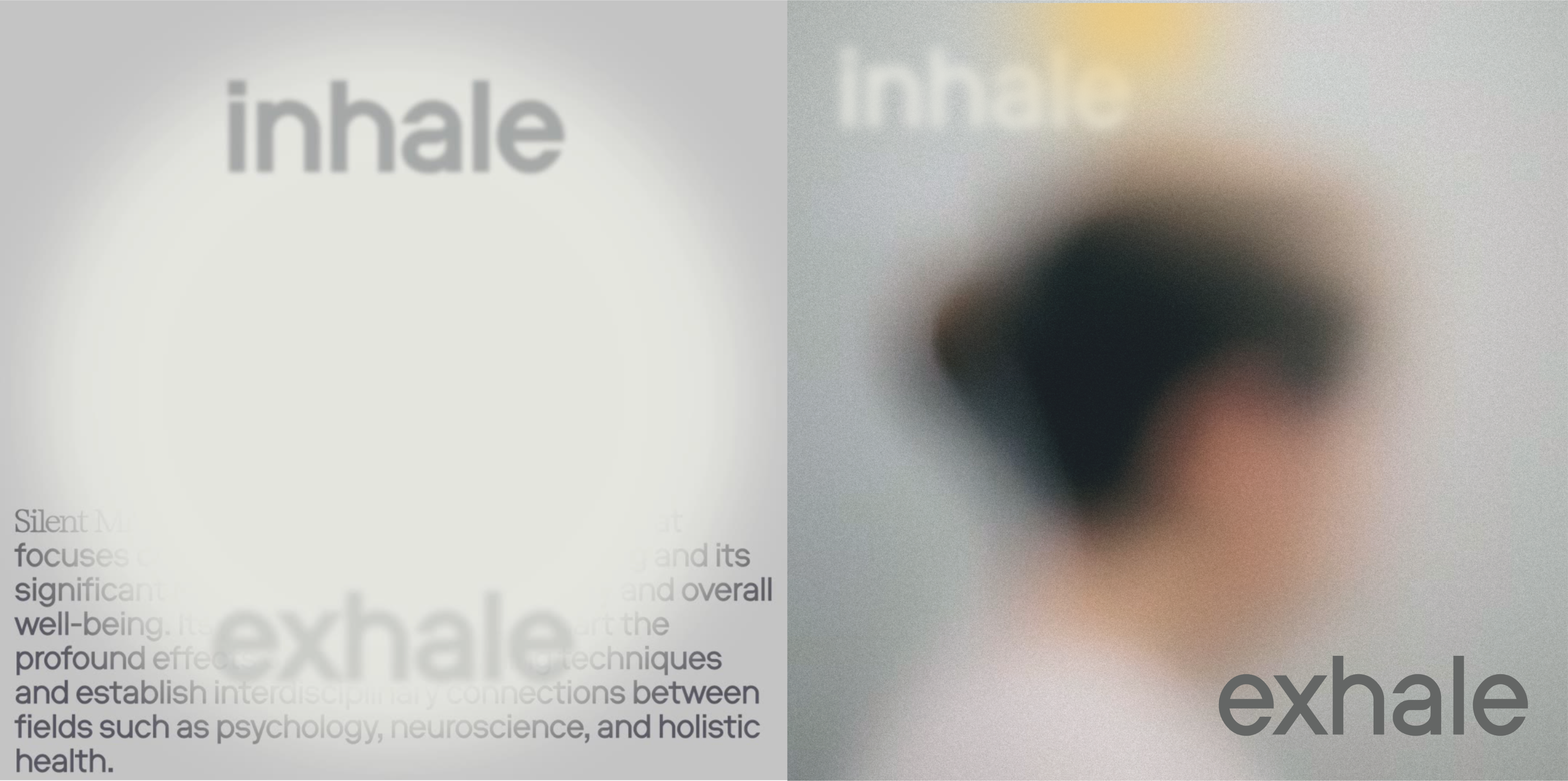
- Silent Mindfulness
BACKGROUND
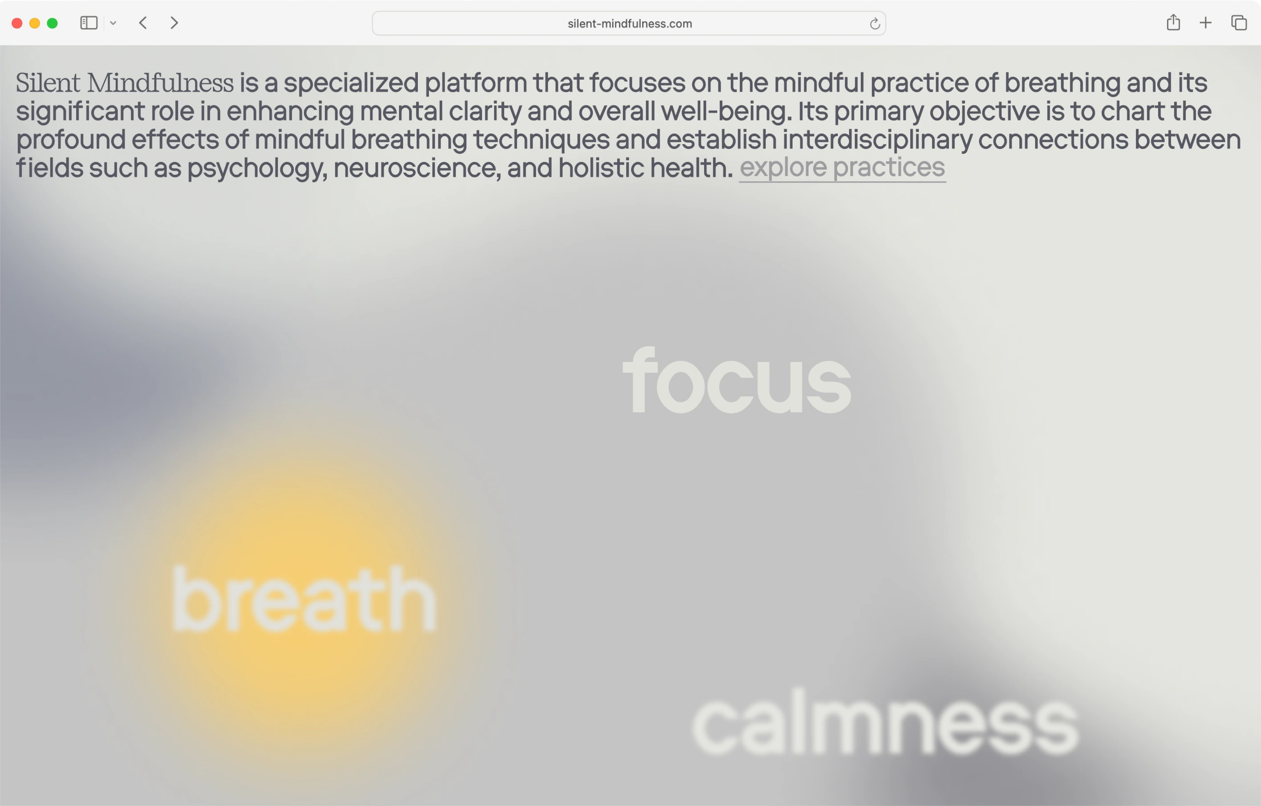
Silent Mindfulness is a freelance project focused on guided breathing and meditation practices. The platform offers group sessions that help participants reconnect with the body through slow breathing, awareness, and gentle movement.
IDEA
The visual identity is built around the idea that a whisper is a word spoken with breath — and breath itself is invisible. This became the core of the design language: typography is softened and blurred, as if spoken quietly and fading into air. The visual system feels weightless and open, with diffused gradients and layered space creating a sense of presence without clear form. The design avoids sharpness and contrast, aiming to reflect the softness of attention and the immersive quality of breathing itself.

I’m a Berlin-based graphic designer focused on brand identities and visual languages. I approach design as a way of researching context, defining meaning, and building visual systems where form and content reflect the project’s inner logic. My goal is to create design that feels relevant, intentional, and aligned with the project's cultural and emotional landscape.
Selected works
- AURA
BACKGROUND
Aura is a concept identity for a shopping mall, developed as part of a client project at Tuman Studio. The work responds to the shifting role of offline retail: in a world where most shopping has moved online, physical spaces need to offer more than just goods — they need to create tangible, memorable experiences.
goal
The metaphor is built around the shopping bag — a simple, universal symbol of offline retail. Its handle becomes the key visual element: applied across different brand creatives, it unifies the mall's diverse tenants and voices into one cohesive system. Each partner's content, once framed by the handle, turns into a shopping bag — something you take home.
IDEA
This approach also offers a playful and lightweight branding tool: by simply adding the handle to any visual, it instantly becomes part of Aura’s world. Whether it's a fashion shoot, a campaign image, or a product — the identity adapts without overcomplicating or overriding existing brand tones. The same shape forms the basis of the logo and graphic language, reflecting the tactile, carry-away nature of offline shopping in a flexible and minimal way.
- expat mag
BACKGROUND
Expat Mag is an independent editorial project developed as a graduation work at HSE Art and Design School. It explores immigration as a lifestyle, not a temporary challenge, but an ongoing, open-ended way of living in a new place.
goal
The goal of the project is to shift the narrative around immigration from survival to self-expression. Rather than focusing on documentation, bureaucracy, or assimilation, Expat Mag highlights the emotional and visual side of relocation. It treats immigration as a personal journey that is confusing, rich in detail, and full of meaning — and asks: what if this experience could be seen as something beautiful?
IDEA
This idea shaped the visual language of the magazine. The identity is built around the metaphor of an unsettled life — text and graphic elements appear slightly off-grid, tilted or misaligned, as if still in motion. The photo style uses direct flash to capture intense, unfiltered impressions — just like the way new immigrants often perceive everything at once, without yet having internal filters. Through this aesthetic, Expat Mag reflects the instability, sensory overload, and hidden poetry of starting over.
CREDITS
Typefaces: ABC Dinamo Synt, ABC Dinamo Favorit | University: HSE ART&DESIGN SCHOOL | Tutor: Evgeny Kashirin | Interview guests: Anna Kolysheva, Milena Medvedeva, Jane Tamm | Shooting location: Richter, Lebigmag | Photography: Julia Selezneva, with contributions by Anna Kolysheva.
- expat mag. print
BACKGROUND
As Expat Mag was conceived as both a media brand and a publication, the visual identity naturally extends into print. The first issue of the magazine puts the concept into physical form, continuing the exploration of immigration as a lifestyle.
goal
It features a collection of interviews with people who have moved abroad, sharing how immigration shapes their routines, emotions, and sense of home. Their stories are accompanied by imagery, typography, and layout choices that follow the same idea — to show the beauty and tension of life in transition.
IDEA
The editorial design continues the visual metaphor of something temporary and shifting. The composition avoids rigid structure: text blocks lean, image placement feels instinctive, and spacing varies across spreads. These decisions echo the experience of adjusting to a new environment — when things feel slightly off, but full of presence and sensitivity.
CREDITS
Typefaces ABC Dinamo Synt, ABC Dinamo Favorit | University: HSE ART&DESIGN SCHOOL | Interview guests Anna Kolysheva, Milena Medvedeva, Jane Tamm | Printing house Мастерская PRO.ЩЕ. | Shooting location Richter, Lebigmag. |Photography Julia Selezneva, with contributions by Anna Kolysheva
- dizengof/99
BACKGROUND
Dizengof/99 is a branding concept for an Israeli restaurant in the center of Moscow, developed as part of a client project at Tuman Studio.
goal
Working with an existing logo, the goal was to build a new visual system that would respect the original identity while expanding its expressive potential.
IDEA
The concept draws inspiration from the slash (/) in the restaurant’s logo — a reference to Dizengoff Street in Tel Aviv. This diagonal line became the key graphic element across the style. It shapes the structure of illustrations, which are built with simple, stroke-based forms, and influences the layout of all materials. Even the physical formats echo the theme, with corners cut at an angle to reflect the slash and create a strong visual rhythm throughout the brand.
CREDITS
Developed as a personal concept at Tuman Studio | Typefaces: Coil, Maregraphe Text | Photography: Elena Gavrilenko, Julia Romanova
- visual research: Independent Magazines as a Media Tool
BACKGROUND
Covers of Independent Magazines as a Media Tool is a student research project developed as part of the diploma preparation at HSE Art and Design School.
goal
Since the main diploma project focused on creating a media platform and a print magazine, this study served as a foundation for understanding the visual and structural logic of independent editorial design.
IDEA
The research analyzes how covers of indie magazines function not only as branding tools, but also as visual statements and curatorial surfaces. The study explores structure, hierarchy, imagery, and typography across various genres — from fashion and culture to niche and art publications. The material is presented in the form of a book; its cover is composed of fragments from existing magazine covers, visually reflecting the layered, referential nature of the subject itself.
- Silent Mindfulness
BACKGROUND
Silent Mindfulness is a freelance project focused on guided breathing and meditation practices. The platform offers group sessions that help participants reconnect with the body through slow breathing, awareness, and gentle movement.
IDEA
The visual identity is built around the idea that a whisper is a word spoken with breath — and breath itself is invisible. This became the core of the design language: typography is softened and blurred, as if spoken quietly and fading into air. The visual system feels weightless and open, with diffused gradients and layered space creating a sense of presence without clear form. The design avoids sharpness and contrast, aiming to reflect the softness of attention and the immersive quality of breathing itself.
I’m a Berlin-based graphic designer focused on brand identities and visual languages. I approach design as a way of researching context, defining meaning, and building visual systems where form and content reflect the project’s inner logic. My goal is to create design that feels relevant, intentional, and aligned with the project's cultural and emotional landscape.
Selected works
- AURA
BACKGROUND
Aura is a concept identity for a shopping mall, developed as part of a client project at Tuman Studio. The work responds to the shifting role of offline retail: in a world where most shopping has moved online, physical spaces need to offer more than just goods — they need to create tangible, memorable experiences.
goal
The metaphor is built around the shopping bag — a simple, universal symbol of offline retail. Its handle becomes the key visual element: applied across different brand creatives, it unifies the mall's diverse tenants and voices into one cohesive system. Each partner's content, once framed by the handle, turns into a shopping bag — something you take home.
IDEA
This approach also offers a playful and lightweight branding tool: by simply adding the handle to any visual, it instantly becomes part of Aura’s world. Whether it's a fashion shoot, a campaign image, or a product — the identity adapts without overcomplicating or overriding existing brand tones. The same shape forms the basis of the logo and graphic language, reflecting the tactile, carry-away nature of offline shopping in a flexible and minimal way.
- expat mag
BACKGROUND
Expat Mag is an independent editorial project developed as a graduation work at HSE Art and Design School. It explores immigration as a lifestyle, not a temporary challenge, but an ongoing, open-ended way of living in a new place.
goal
The goal of the project is to shift the narrative around immigration from survival to self-expression. Rather than focusing on documentation, bureaucracy, or assimilation, Expat Mag highlights the emotional and visual side of relocation. It treats immigration as a personal journey that is confusing, rich in detail, and full of meaning — and asks: what if this experience could be seen as something beautiful?
IDEA
This idea shaped the visual language of the magazine. The identity is built around the metaphor of an unsettled life — text and graphic elements appear slightly off-grid, tilted or misaligned, as if still in motion. The photo style uses direct flash to capture intense, unfiltered impressions — just like the way new immigrants often perceive everything at once, without yet having internal filters. Through this aesthetic, Expat Mag reflects the instability, sensory overload, and hidden poetry of starting over.
CREDITS
Typefaces: ABC Dinamo Synt, ABC Dinamo Favorit | University: HSE ART&DESIGN SCHOOL | Tutor: Evgeny Kashirin |
Interview guests: Anna Kolysheva, Milena Medvedeva, Jane Tamm | Shooting location:
Richter, Lebigmag | Photography: Julia Selezneva, with contributions by Anna Kolysheva
- expat mag. print
BACKGROUND
As Expat Mag was conceived as both a media brand and a publication, the visual identity naturally extends into print. The first issue of the magazine puts the concept into physical form, continuing the exploration of immigration as a lifestyle.
goal
It features a collection of interviews with people who have moved abroad, sharing how immigration shapes their routines, emotions, and sense of home. Their stories are accompanied by imagery, typography, and layout choices that follow the same idea — to show the beauty and tension of life in transition.
IDEA
The editorial design continues the visual metaphor of something temporary and shifting. The composition avoids rigid structure: text blocks lean, image placement feels instinctive, and spacing varies across spreads. These decisions echo the experience of adjusting to a new environment — when things feel slightly off, but full of presence and sensitivity.
CREDITS
Typefaces: ABC Dinamo Synt, ABC Dinamo Favorit | University: HSE ART&DESIGN SCHOOL | Interview guests Anna Kolysheva, Milena Medvedeva, Jane Tamm | Printing house: Mастерская PRO.ЩЕ | Shooting location: Richter, Lebigmag |Photography: Julia Selezneva, with contributions by Anna Kolysheva.
- dizengof/99
BACKGROUND
Dizengof/99 is a branding concept for an Israeli restaurant in the center of Moscow, developed as part of a client project at Tuman Studio.
goal
Working with an existing logo, the goal was to build a new visual system that would respect the original identity while expanding its expressive potential.
IDEA
The concept draws inspiration from the slash (/) in the restaurant’s logo — a reference to Dizengoff Street in Tel Aviv. This diagonal line became the key graphic element across the style. It shapes the structure of illustrations, which are built with simple, stroke-based forms, and influences the layout of all materials. Even the physical formats echo the theme, with corners cut at an angle to reflect the slash and create a strong visual rhythm throughout the brand.
CREDITS
Developed as a personal concept at Tuman Studio | Typefaces: Coil, Maregraphe Text | Photography: Elena Gavrilenko, Julia Romanova
- visual research: Independent Magazines as a Media Tool
BACKGROUND
Covers of Independent Magazines as a Media Tool is a student research project developed as part of the diploma preparation at HSE Art and Design School.
goal
Since the main diploma project focused on creating a media platform and a print magazine, this study served as a foundation for understanding the visual and structural logic of independent editorial design.
IDEA
The research analyzes how covers of indie magazines function not only as branding tools, but also as visual statements and curatorial surfaces. The study explores structure, hierarchy, imagery, and typography across various genres — from fashion and culture to niche and art publications. The material is presented in the form of a book; its cover is composed of fragments from existing magazine covers, visually reflecting the layered, referential nature of the subject itself.
- Silent Mindfulness
BACKGROUND
Silent Mindfulness is a freelance project focused on guided breathing and meditation practices. The platform offers group sessions that help participants reconnect with the body through slow breathing, awareness, and gentle movement.
IDEA
The visual identity is built around the idea that a whisper is a word spoken with breath — and breath itself is invisible. This became the core of the design language: typography is softened and blurred, as if spoken quietly and fading into air. The visual system feels weightless and open, with diffused gradients and layered space creating a sense of presence without clear form. The design avoids sharpness and contrast, aiming to reflect the softness of attention and the immersive quality of breathing itself.